Gapminder & Brexit Data Analysis

Task 1: gapminder country comparison
The gapminder dataset is imported, and this has data on life expectancy, population, and GDP per capita for 142 countries from 1952 to 2007. Below is a ‘glimpse’ of the data frame, as well as the first 20 lines within the ‘table’.
glimpse(gapminder)## Rows: 1,704
## Columns: 6
## $ country <fct> "Afghanistan", "Afghanistan", "Afghanistan", "Afghanistan", …
## $ continent <fct> Asia, Asia, Asia, Asia, Asia, Asia, Asia, Asia, Asia, Asia, …
## $ year <int> 1952, 1957, 1962, 1967, 1972, 1977, 1982, 1987, 1992, 1997, …
## $ lifeExp <dbl> 28.801, 30.332, 31.997, 34.020, 36.088, 38.438, 39.854, 40.8…
## $ pop <int> 8425333, 9240934, 10267083, 11537966, 13079460, 14880372, 12…
## $ gdpPercap <dbl> 779.4453, 820.8530, 853.1007, 836.1971, 739.9811, 786.1134, …head(gapminder, 20) # look at the first 20 rows of the dataframe## # A tibble: 20 × 6
## country continent year lifeExp pop gdpPercap
## <fct> <fct> <int> <dbl> <int> <dbl>
## 1 Afghanistan Asia 1952 28.8 8425333 779.
## 2 Afghanistan Asia 1957 30.3 9240934 821.
## 3 Afghanistan Asia 1962 32.0 10267083 853.
## 4 Afghanistan Asia 1967 34.0 11537966 836.
## 5 Afghanistan Asia 1972 36.1 13079460 740.
## 6 Afghanistan Asia 1977 38.4 14880372 786.
## 7 Afghanistan Asia 1982 39.9 12881816 978.
## 8 Afghanistan Asia 1987 40.8 13867957 852.
## 9 Afghanistan Asia 1992 41.7 16317921 649.
## 10 Afghanistan Asia 1997 41.8 22227415 635.
## 11 Afghanistan Asia 2002 42.1 25268405 727.
## 12 Afghanistan Asia 2007 43.8 31889923 975.
## 13 Albania Europe 1952 55.2 1282697 1601.
## 14 Albania Europe 1957 59.3 1476505 1942.
## 15 Albania Europe 1962 64.8 1728137 2313.
## 16 Albania Europe 1967 66.2 1984060 2760.
## 17 Albania Europe 1972 67.7 2263554 3313.
## 18 Albania Europe 1977 68.9 2509048 3533.
## 19 Albania Europe 1982 70.4 2780097 3631.
## 20 Albania Europe 1987 72 3075321 3739.This data can be used to produce two graphs of how life expectancy has changed over the years for the country and the continent I come from - in this case the United Kingdom and Europe. We will now produce three graphs which show how the life expectancy (for different regions) evolves over time, starting by filtering the data for these specific regions.
country_data <- gapminder %>%
            filter(country == "United Kingdom")
continent_data <- gapminder %>%
            filter(continent == "Europe")
Life Expectancy in the United Kingdom over time.
First, we plot of life expectancy over time for a single country of choice - the United Kingdom. This is done by mapping year on the x-axis, and lifeExp on the y-axis. We use ‘geom_smooth’ to incorporate a line of best fit, as well as ‘labs’ to label the graph.
plot1 <- ggplot(data = country_data, mapping = aes(x = year, y = lifeExp))+
   geom_point() +
   geom_smooth(se = FALSE)+
   labs(title = "Average UK Life Expectancy over time.",
       x = "Year",
       y = "Average Life Expectancy") +
   NULL
plot1
## `geom_smooth()` using method = 'loess' and formula 'y ~ x'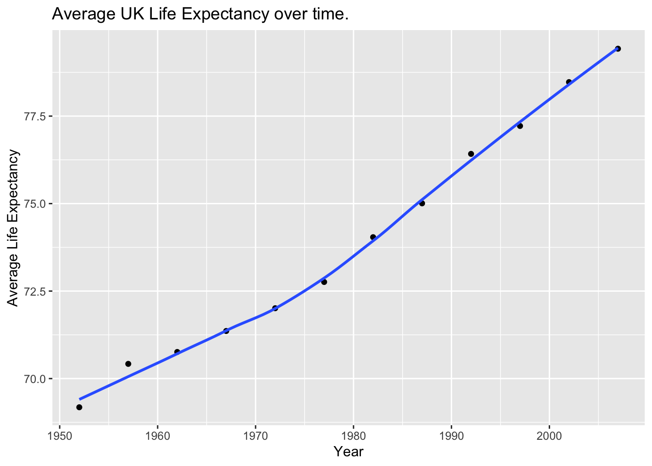
As we can see, the life expectancy in the UK has been gradually increasing since the 1950s, following what seems to be (close to) a linear progression.
Life Expectancy in Europe over time.
Secondly, we produce a plot for all countries in Europe. This is done by mapping the country variable to the colour aesthetic. We also map country to the group aesthetic, so that all points for each country are grouped together.
ggplot(continent_data, mapping = aes(x = year  , y = lifeExp , colour = country , group = country))+
  geom_line() +
  geom_smooth(se = FALSE) +
  labs(title = "Average Life Expectancy over time for European Countries.",
       x = "Year",
       y = "Average Life Expectancy") +
  NULL
## `geom_smooth()` using method = 'loess' and formula 'y ~ x'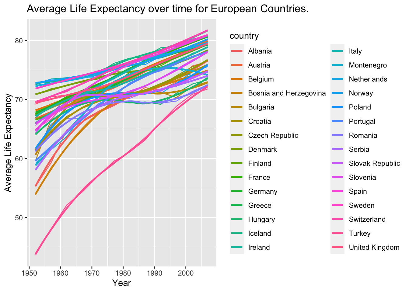
Although this graph is hard to interperet, due to the large quantity of data, we can notably see that all European countries have seen an increase in life expectancy. The most notable outlier, Turkey, started with a particularly low life expactancy (less than 45) in 1950, but has now caught up with the rest of the pack.
Life Expectancy in different continents over time.
Finally, using the original gapminder data, we produce a life expectancy over time graph, grouped (or faceted) by continent - using the ‘facet_wrap’ function. The legend is removed by adding the theme(legend.position="none") in the end of our ggplot.
ggplot(data = gapminder , mapping = aes(x = year , y = lifeExp  , colour = continent ))+
  geom_point() +
  geom_smooth(se = FALSE) +
  facet_wrap(~continent) +
  theme(legend.position="none") + #remove all legends
  labs(title = "Average Life Expectancy over time for different Continents.",
       x = "Year",
       y = "Average Life Expectancy") +
  NULL
## `geom_smooth()` using method = 'loess' and formula 'y ~ x'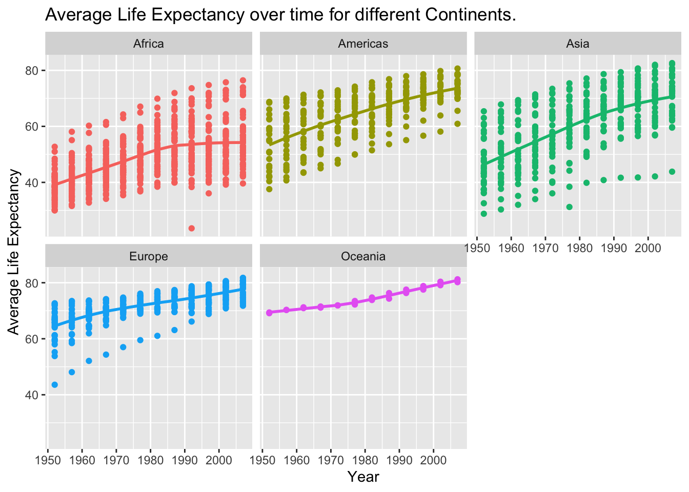
The continents that have seen the sharpest rises in life expectancy since 1952 are those which contain emerging economies. Countries that have exhibited substantial economic growth in this period, such as Brazil, China, India, Indonesia, Malaysia and Mexico, are typically located in Asia or the Americas. This is likely why these continents seem to have exhibited the highest growth, as the economic development within their countries has led to improved healthcare, technology, diet and living standards.
Growth in Africa followed an upward trend between 1950 - 1990 that exhibited a similar gradient to other fast-growing continents. But this increase levelled off shortly after, which is likely due to limited economic power (which is enhanced by major corruption in many of these countries), as well as poor healthcare and many conflicts/wars on this continent causing many young deaths.
As expected, continents whose economic growth primarily accelerated before the 1950s - namely Europe and Oceania - exhibit a smaller increase in life expectancy during the above time-frame.
Task 2: Brexit vote analysis
We will have a look at the results of the 2016 Brexit vote in the UK. First we read the data using read_csv() and have a quick glimpse at the data (shown below).
brexit_results <- read_csv("../../data/brexit_results.csv")
glimpse(brexit_results)
## Rows: 632
## Columns: 11
## $ Seat <chr> "Aldershot", "Aldridge-Brownhills", "Altrincham and Sale W…
## $ con_2015 <dbl> 50.592, 52.050, 52.994, 43.979, 60.788, 22.418, 52.454, 22…
## $ lab_2015 <dbl> 18.333, 22.369, 26.686, 34.781, 11.197, 41.022, 18.441, 49…
## $ ld_2015 <dbl> 8.824, 3.367, 8.383, 2.975, 7.192, 14.828, 5.984, 2.423, 1…
## $ ukip_2015 <dbl> 17.867, 19.624, 8.011, 15.887, 14.438, 21.409, 18.821, 21.…
## $ leave_share <dbl> 57.89777, 67.79635, 38.58780, 65.29912, 49.70111, 70.47289…
## $ born_in_uk <dbl> 83.10464, 96.12207, 90.48566, 97.30437, 93.33793, 96.96214…
## $ male <dbl> 49.89896, 48.92951, 48.90621, 49.21657, 48.00189, 49.17185…
## $ unemployed <dbl> 3.637000, 4.553607, 3.039963, 4.261173, 2.468100, 4.742731…
## $ degree <dbl> 13.870661, 9.974114, 28.600135, 9.336294, 18.775591, 6.085…
## $ age_18to24 <dbl> 9.406093, 7.325850, 6.437453, 7.747801, 5.734730, 8.209863…The data comes from Elliott Morris, who cleaned it and made it available through his DataCamp class on analysing election and polling data in R.
Our main outcome variable (or y) is leave_share, which is the percent of votes cast in favour of Brexit, or leaving the EU. Each row is a UK parliament constituency.
To get a sense of the spread, or distribution, of the data, we can plot a histogram, a density plot, and the empirical cumulative distribution function of the leave % in all constituencies.
# histogram
ggplot(brexit_results, aes(x = leave_share)) +
  geom_histogram(binwidth = 2.5) +
  labs(title = "Brexit Leave Share - Histogram",
       x = "Leave Share [%]",
       y = "Frequency of Constituencies",
       subtitle = "Figure 3.1")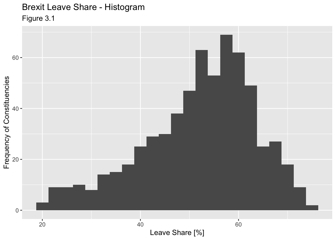
# density plot-- think smoothed histogram
ggplot(brexit_results, aes(x = leave_share)) +
  geom_density()+
  labs(title = "Brexit Leave Share - Density Plot",
       x = "Leave Share [%]",
       y = "Frequency of Constituencies",
       subtitle = "Figure 3.2")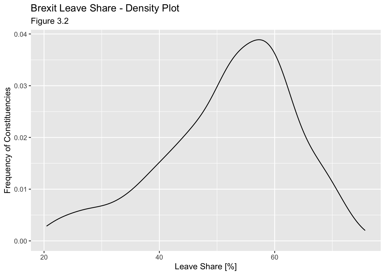
# The empirical cumulative distribution function (ECDF)
ggplot(brexit_results, aes(x = leave_share)) +
  stat_ecdf(geom = "step", pad = FALSE) +
  scale_y_continuous(labels = scales::percent)+
  labs(title = "Brexit Leave Share - Cumulative Distribution Function Plot",
       x = "Leave Share [%]",
       y = "Frequency of Constituencies",
       subtitle = "Figure 3.3")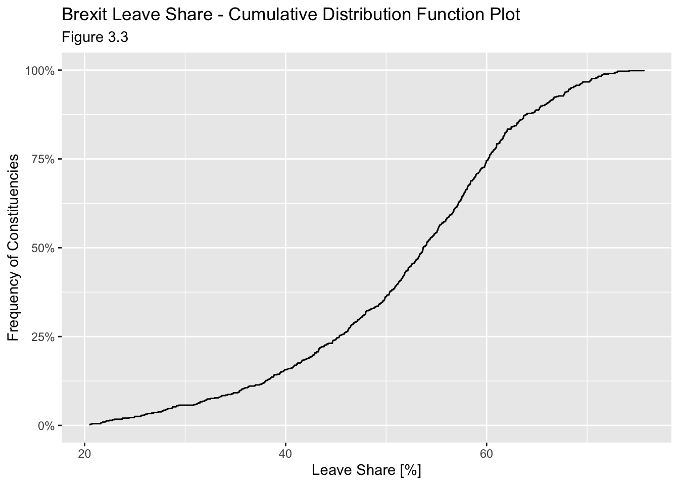
One common explanation for the Brexit outcome was fear of immigration and opposition to the EU’s more open border policy. We can check the relationship (or correlation) between the proportion of native born residents (born_in_uk) in a constituency and its leave_share. To do this, let us get the correlation between the two variables. This can be done using the ‘cor’ function.
brexit_results %>%
  select(leave_share, born_in_uk) %>%
  cor()
## leave_share born_in_uk
## leave_share 1.0000000 0.4934295
## born_in_uk 0.4934295 1.0000000The correlation is almost 0.5, which shows that the two variables are positively correlated - although the correlation could be stronger (up to a potential value of +1).
We can also create a scatterplot between these two variables using geom_point. We also add the best fit line, using geom_smooth(method = "lm").
ggplot(brexit_results, aes(x = born_in_uk, y = leave_share)) +
  geom_point(alpha=0.3) +

  # add a smoothing line, and use method="lm" to get the best straight-line
  geom_smooth(method = "lm") +

  # use a white background and frame the plot with a black box
  theme_bw() +
  labs(title = "Relationship between the proportion of native born residents and leave share.",
       x = "Born in the UK [%]",
       y = "Leave Share [%]",
       subtitle = "Figure 3.4")
## `geom_smooth()` using formula 'y ~ x'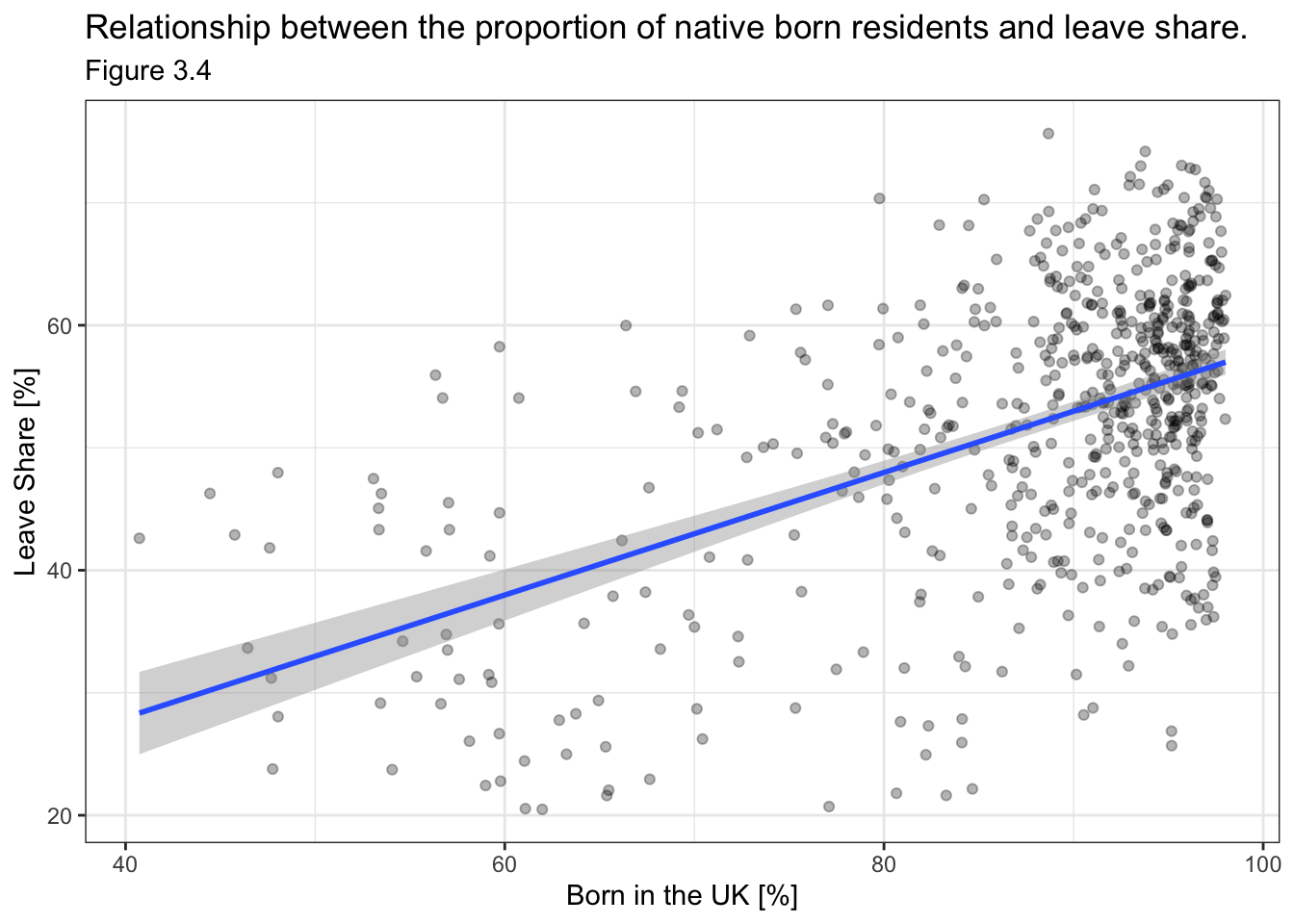
This relationship clearly shows that constituencies with a larger percentage of native British people are more likely to have a larger leave share. This is expected as those born in the UK are expected to feel more nationalistic when it comes to the key issues of Brexit - namely, immigration, pressure on the NHS and other public services, etc.
This task was extrapolated further in AM01 - Applied Statistics Homework 3, where for every constituency, we plotted leave share (%) against the percentage (%) of votes for the UK’s main political parties in the 2015 general election. This allows us to examine the potentiaal correlation between voting for a particular political party and voting for Brexit.
This involved using the ‘select’ and ‘pivot_longer’ function to group data by the main political parties (Labour, Conservatives, UKIP and Liberal Democrat). By pivoting the table, we can easily plot the leave percentage against the party vote percentage for each party within each constituency. We fit a line of best fit to the data for each political party using geom_smooth - which allows for useful comparison and prediction.
temp_brexit <- brexit_results %>%
  select(con_2015, lab_2015, ld_2015, ukip_2015, leave_share) %>%
  pivot_longer(cols = 1:4, names_to = "party", values_to = "party_percentage")

cols <- c("con_2015" = "#0087dc", "lab_2015" = "#d50000", "ld_2015" = "#FDBB30", "ukip_2015" = "#EFE600")

temp_brexit %>%
  ggplot(aes(x=party_percentage,y=leave_share, group=party, color=party)) +
  geom_point(size = 0.5, alpha = 0.2)+
  geom_smooth(method=lm, size = 0.5)+
  labs(title = "How political affiliation translated to Brexit Voting", x = "Party % in the UK 2015 general election", y = "Leave % in the 2016 Brexit referendum")+
  scale_colour_manual(labels = c("Conservative", "Labour","Lib Dems","UKIP"), values = cols)+
  theme_bw()+
  theme(legend.position = "bottom",plot.title = element_text(face = "bold", size = 13))+
  theme(legend.title = element_blank())+
  NULL
## `geom_smooth()` using formula 'y ~ x'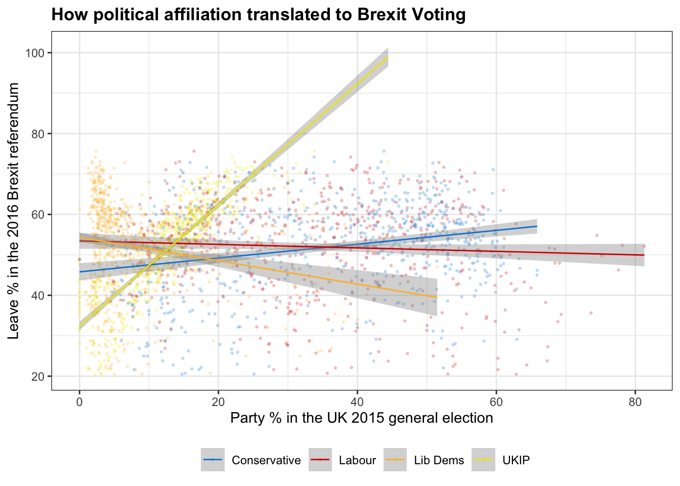
The graph here can be used to determine whether there is a correlation between voting for a particular political party and voting for Brexit. As we can see there is a strong positive correlation between UKIP voting and leave voting - this is expected as the values of UKIP are closely aligned with those of Brexit. Although weaker, there is a negative correlation between voting for the liberal democrats and voting for leave - indicating that Liberal Democrat voters are more likely to be pro-European.
Finally, we can see that the correlations for the main two political parties were fairly weak at the time of voting. There is a very slight positive correlation associated with voting Brexit and voting Conservative, along with a very weak negative correlation associated with voting Brexit and voting Labour. The explanation of this could probably fill its own blog, but ultimately, it shows that Dominic Cummings and the ‘Vote Leave’ team were successful in getting the issues associated with Brexit to transcend traditional political ideology. By making issues such as the NHS, fishing rights and migrant’s (realistically minimal) impact on wages and public services central to the campaign, Vote Leave was able to convince both traditionally eurosceptic Conservative voters and poor, marginalised Labour voters that leaving the EU would be beneficial.