Final Project - Ask a Manager Survey

Study Group 2 - Final Assignment - Cleaning and Analysing the “Ask a Manager 2021 Survey” Dataset.
This is the Final Group Project for the AM01 - Applied Statistics module. It involved cleaning, exploring and analysing the “Ask a Manager 2021 survey” data. My contributions to this group project can primarily be found in Sections 1 and 2.
Section 1 - Importing and Cleaning the Data
Importing the data and relevant libraries
We begin by importing the following libraries to aid our analysis…
library(googlesheets4)
library(tidyverse)
library(janitor)
library(skimr)
library(countrycode) # to clean up country names
library(broom)
library(car)
library(ggfortify)
library(countrycode)
library(rvest)
library(quantmod)
library(moderndive)
library(fastDummies)
library(see)
library(ggrepel)
library(infer)
Next, we use googlesheets4 to gain authorization to the “Ask a Manager 2021 survey” data sheet.
# Use googlesheets4 to get data
url <- "https://docs.google.com/spreadsheets/d/1IPS5dBSGtwYVbjsfbaMCYIWnOuRmJcbequohNxCyGVw/edit?resourcekey#gid=1625408792"
googlesheets4::gs4_auth() # google sheets authorisation
We subsequently assign the raw data to a new variable (ask_a_manager_2021), which we then skim to view a summary of the data - this includes the size of the dataset, as well as the variable types amongst other information.
# load "Ask a A Manager 2021 Survey" googlesheet
# https://www.askamanager.org/
ask_a_manager_2021 <- googlesheets4::read_sheet(url) %>%
janitor::clean_names()skimr::skim(ask_a_manager_2021)| Name | ask_a_manager_2021 |
| Number of rows | 26781 |
| Number of columns | 18 |
| _______________________ | |
| Column type frequency: | |
| character | 14 |
| list | 2 |
| numeric | 1 |
| POSIXct | 1 |
| ________________________ | |
| Group variables | None |
Variable type: character
| skim_variable | n_missing | complete_rate | min | max | empty | n_unique | whitespace |
|---|---|---|---|---|---|---|---|
| how_old_are_you | 0 | 1.00 | 5 | 10 | 0 | 7 | 0 |
| industry | 62 | 1.00 | 2 | 171 | 0 | 1084 | 0 |
| job_title | 0 | 1.00 | 1 | 126 | 0 | 12845 | 0 |
| additional_context_on_job_title | 19880 | 0.26 | 1 | 781 | 0 | 6616 | 0 |
| currency | 0 | 1.00 | 3 | 7 | 0 | 11 | 0 |
| additional_context_on_income | 23865 | 0.11 | 1 | 1143 | 0 | 2840 | 0 |
| country | 0 | 1.00 | 1 | 209 | 0 | 297 | 0 |
| state | 4761 | 0.82 | 4 | 114 | 0 | 125 | 0 |
| city | 8 | 1.00 | 1 | 171 | 0 | 4072 | 0 |
| overall_years_of_professional_experience | 0 | 1.00 | 9 | 16 | 0 | 8 | 0 |
| years_of_experience_in_field | 0 | 1.00 | 9 | 16 | 0 | 8 | 0 |
| highest_level_of_education_completed | 202 | 0.99 | 3 | 34 | 0 | 6 | 0 |
| gender | 155 | 0.99 | 3 | 29 | 0 | 5 | 0 |
| race | 151 | 0.99 | 5 | 125 | 0 | 47 | 0 |
Variable type: list
| skim_variable | n_missing | complete_rate | n_unique | min_length | max_length |
|---|---|---|---|---|---|
| other_monetary_comp | 0 | 1 | 810 | 0 | 1 |
| currency_other | 0 | 1 | 105 | 0 | 1 |
Variable type: numeric
| skim_variable | n_missing | complete_rate | mean | sd | p0 | p25 | p50 | p75 | p100 | hist |
|---|---|---|---|---|---|---|---|---|---|---|
| annual_salary | 0 | 1 | 144953.7 | 5486518 | 0 | 54000 | 75725 | 110000 | 8.7e+08 | ▇▁▁▁▁ |
Variable type: POSIXct
| skim_variable | n_missing | complete_rate | min | max | median | n_unique |
|---|---|---|---|---|---|---|
| timestamp | 0 | 1 | 2021-04-27 11:02:09 | 2021-09-20 23:36:43 | 2021-04-28 12:36:43 | 26776 |
By analysing n_missing and n_unique, we can gain an insight into which variables will require the most cleaning. For example, variables such as job_title and city have many unique entries - making it likely that these variables will be more difficult to clean.
Cleaning the Data.
We begin by cleaning the “country” variable. This involves using standardised ‘countrycode’ to convert the countries into a standard, recognisable format.
Firstly, we need to alter the names of entries that cannot be recognised by the ‘countrycode’… for example - “England” is not picked up by the ‘countrycode’, we need to change occurrences of “England” to “UK”. We ignore misspellings, as they only represent a small portion of the data set.
# Clean specific country names so that they can be recognised by iso3 countrycode.
ask_a_manager_2021$country <- gsub("England", "UK", ask_a_manager_2021$country)
ask_a_manager_2021$country <- gsub("Scotland", "UK", ask_a_manager_2021$country)
ask_a_manager_2021$country <- gsub("England, UK", "UK", ask_a_manager_2021$country)
ask_a_manager_2021$country <- gsub("Northern Ireland", "UK", ask_a_manager_2021$country)
ask_a_manager_2021$country <- gsub("Wales", "UK", ask_a_manager_2021$country)
ask_a_manager_2021$country <- gsub("U. S.", "USA", ask_a_manager_2021$country)
ask_a_manager_2021$country <- gsub("America", "USA", ask_a_manager_2021$country)
Now that we have completed this, we can apply the country code to standardise the names of the country variables. These can be found in a new column “Country”, within the ask_a_manager_2021 data frame.
# Clean "country"
# Use countrycode::countryname() to clean country names
salary_iso3 <- ask_a_manager_2021 %>%
  select(country) %>%
  pull() %>%
  countrycode(
    origin = "country.name",
    destination = "iso3c") %>%
  as_tibble()

ask_a_manager_2021 <- bind_cols(ask_a_manager_2021, salary_iso3)

#Change the column name
colnames(ask_a_manager_2021)[19] <- "Country"
Next, we create a new dataframe by selecting the columns (variables) that are most suitable for analysis. For example, this involves omitting the column additional_context_on_job_title. This column contains little information that is appropriate for statistical analysis.
#Create a new dataframe for the desired data
clean_data <- ask_a_manager_2021 %>%
  select(how_old_are_you, industry, currency,Country,state,city,overall_years_of_professional_experience,years_of_experience_in_field,highest_level_of_education_completed,gender,race,other_monetary_comp,annual_salary)
We repeat the procedure we used to clean the country data for the states - using a standardised code and correcting for any anomalies that cannot be picked up by this standardisation.
#Clean "states" so that they can be recognised by specific state code.
clean_data$state <- gsub("District of Columbia, Virginia", "Virginia", clean_data$state)
clean_data$state <- gsub("District of Columbia, Maryland", "Maryland", clean_data$state)
clean_data$state <- gsub("District of Columbia, Washington", "Maryland", clean_data$state)
The state names are standardised as follows, using the abbreviations taken from the following wikipedia page.
# Use state abbreviations to categorise state entries
url <- "https://en.wikipedia.org/wiki/List_of_states_and_territories_of_the_United_States"

# get tables that exist on wikipedia page
tables <- url %>%
  read_html() %>%
  html_nodes(css="table")

# parse HTML tables into a dataframe called polls
# Use purr::map() to create a list of all tables in URL
states <- map(tables, . %>%
             html_table(fill=TRUE)%>%
             janitor::clean_names())
states_data <- states[[2]] %>%
  select(flag_name_andpostal_abbreviation_13, flag_name_andpostal_abbreviation_13_2)
states_data = states_data[-1,]

colnames(states_data) <- c("state", "state_abb")

states_data[17,1] <- "Kentucky"
states_data[21,1] <- "Massachusetts"
states_data[38,1] <- "Pennsylvania"
states_data[46,1] <- "Virginia"
The cleaned state variable is joined to the ‘clean_data’ data frame.
# Bind the state abbreviation column in to clean_data
clean_data <- clean_data %>%
  left_join(states_data, by="state")
We can confirm the state cleaning has worked by counting the state abbreviations column - this has 51 entries - the 50 states + NA entries (which arise due to the large number of people completing this survey who live outside of America, as well as those who live in the District of Columbia which is not registered as a state).
temp <- clean_data[is.na(clean_data$state_abb),]
temp2 <- clean_data %>%
  count(state_abb, sort = TRUE)
temp2
## # A tibble: 51 × 2
## state_abb n
## <chr> <int>
## 1 <NA> 5821
## 2 CA 2491
## 3 NY 2084
## 4 MA 1489
## 5 TX 1199
## 6 IL 1156
## 7 WA 1139
## 8 PA 900
## 9 VA 757
## 10 MN 688
## # … with 41 more rowsThe gender variable is cleaned by adding entries with “Prefer not to answer” to the “Other or prefer not to answer” group.
#Clean "gender"
clean_data$gender <- gsub("Prefer not to answer", "Other or prefer not to answer", clean_data$gender)
clean_data$gender <- gsub("Non-binary", "Other or prefer not to answer", clean_data$gender)
The “industry” data is cleaned manually, by grouping similar categories of industry. We clean data for all industries that have n >= 5, beyond this point we assume that further cleaning of the data will have a negligible effect when comparing the characteristics of the main (most-common) industries.
#Clean "industry"
clean_data$industry <- gsub("Pharmaceuticals", "Pharma", clean_data$industry)
clean_data$industry <- gsub("Pharmaceutical", "Pharma", clean_data$industry)
clean_data$industry <- gsub("Pharma Development", "Pharma", clean_data$industry)
clean_data$industry <- gsub("Pharma Manufacturing", "Pharma", clean_data$industry)
clean_data$industry <- gsub("Pharma/biotechnology", "Pharma", clean_data$industry)
clean_data$industry <- gsub("Pharma R&D", "Pharma", clean_data$industry)

clean_data$industry <- gsub("Libraries", "Library", clean_data$industry)
clean_data$industry <- gsub("Public library", "Library", clean_data$industry)
clean_data$industry <- gsub("Librarian", "Library", clean_data$industry)
clean_data$industry <- gsub("public library", "Library", clean_data$industry)
clean_data$industry <- gsub("library", "Library", clean_data$industry)

clean_data$industry <- gsub("Biotech/pharmaceuticals", "Biotech", clean_data$industry)
clean_data$industry <- gsub("Biotech/Pharma", "Biotech", clean_data$industry)
clean_data$industry <- gsub("Biotechnology", "Biotech", clean_data$industry)

clean_data$industry <- gsub("Environmental Consulting", "Environmental", clean_data$industry)

clean_data$industry <- gsub("Scientific Research", "Science", clean_data$industry)

clean_data$industry <- gsub("Law Enforcement & Security", "Law", clean_data$industry)

clean_data$industry <- gsub("Consulting", "Business or Consulting", clean_data$industry)
clean_data$industry <- gsub("Business or Business or Consulting", "Business or Consulting", clean_data$industry)

clean_data$industry <- gsub("Commercial Real Estate", "Real Estate", clean_data$industry)

clean_data$industry <- gsub("Museums", "Museum", clean_data$industry)

clean_data$industry <- gsub("Oil & Gas", "Oil and Gas", clean_data$industry)

clean_data$industry <- gsub("manufacturing", "Manufacturing", clean_data$industry)
The “city” data is also cleaned manually, this is done by grouping repeated names of the same city - for instance “New York”, “New York City”, “NYC” are all grouped as “NY”. We clean data for all cities that have n >= 5, beyond this point we assume that further cleaning of the data will have a negligible effect when comparing the characteristics of the main (most lived in) cities. For example - when comparing the average salaries of people who live in New York with those who live in Washington - further cleaning of city data with n < 5 items will not largely impact this comparison.
#Clean City Data (clean all cities with n >= 5)
clean_data$city <- gsub("New York City", "NY", clean_data$city)
clean_data$city <- gsub("New York", "NY", clean_data$city)
clean_data$city <- gsub("Washington, DC", "DC", clean_data$city)
clean_data$city <- gsub("Washington", "DC", clean_data$city)
clean_data$city <- gsub("Washington DC", "DC", clean_data$city)
clean_data$city <- gsub("DC DC", "DC", clean_data$city)
clean_data$city <- gsub("DC, D.C.", "DC", clean_data$city)
clean_data$city <- gsub("Long Beach", "LA", clean_data$city)
clean_data$city <- gsub("District of Columbia", "DC", clean_data$city)
clean_data$city <- gsub("Manhattan", "NY", clean_data$city)
clean_data$city <- gsub("San Francisco", "San Fran", clean_data$city)
clean_data$city <- gsub("San Francisco Bay Area", "San Fran", clean_data$city)
clean_data$city <- gsub("new york", "NY", clean_data$city)
clean_data$city <- gsub("DC D.C.", "DC", clean_data$city)
clean_data$city <- gsub("SF Bay Area", "San Fran", clean_data$city)
clean_data$city <- gsub("New york", "NY", clean_data$city)
clean_data$city <- gsub("Vancouver, BC", "Vancouver", clean_data$city)
clean_data$city <- gsub("Bay Area", "San Fran", clean_data$city)
clean_data$city <- gsub("Cambridge, MA", "Cambridge", clean_data$city)
clean_data$city <- gsub("Boston, MA", "Boston", clean_data$city)
clean_data$city <- gsub("portland", "Portland", clean_data$city)
clean_data$city <- gsub("Frisco", "San Fran", clean_data$city)
clean_data$city <- gsub("Chicago suburbs", "Chicago", clean_data$city)
clean_data$city <- gsub("D.C.", "DC", clean_data$city)
clean_data$city <- gsub("South San Francisco", "San Fran", clean_data$city)
clean_data$city <- gsub("Chicago Suburbs", "Chicago", clean_data$city)
clean_data$city <- gsub("NYC, NY", "NY", clean_data$city)
clean_data$city <- gsub("Boston area", "Boston", clean_data$city)
clean_data$city <- gsub("chicago", "Chicago", clean_data$city)
clean_data$city <- gsub("Los angeles", "LA", clean_data$city)
clean_data$city <- gsub("Metro Detroit", "Detroit", clean_data$city)
clean_data$city <- gsub("Newcastle upon Tyne", "Newcastle", clean_data$city)
clean_data$city <- gsub("Philadelphia suburbs", "Philadelphia", clean_data$city)
clean_data$city <- gsub("san francisco", "San Fran", clean_data$city)
clean_data$city <- gsub("Ottawa, Ontario", "Ottawa", clean_data$city)
clean_data$city <- gsub("seattle", "Seattle", clean_data$city)
clean_data$city <- gsub("Seattle, WA", "Seattle", clean_data$city)
clean_data$city <- gsub("boston", "Boston", clean_data$city)
clean_data$city <- gsub("London, UK", "London", clean_data$city)
clean_data$city <- gsub("Nyc", "NY", clean_data$city)
clean_data$city <- gsub("NYC city", "NY", clean_data$city)
clean_data$city <- gsub("San francisco", "San Fran", clean_data$city)
clean_data$city <- gsub("atlanta", "Atlanta", clean_data$city)
clean_data$city <- gsub("Atlanta metro area", "Atlanta", clean_data$city)
clean_data$city <- gsub("Bronx", "NY", clean_data$city)
clean_data$city <- gsub("Boston Area", "Boston", clean_data$city)
clean_data$city <- gsub("Chicago, IL", "Chicago", clean_data$city)
clean_data$city <- gsub("Greater Toronto Area", "Toronto", clean_data$city)
clean_data$city <- gsub("indianapolis", "Indianapolis", clean_data$city)
clean_data$city <- gsub("los angeles", "LA", clean_data$city)
clean_data$city <- gsub("NYC", "NY", clean_data$city)
clean_data$city <- gsub("Santa Monica", "LA", clean_data$city)
clean_data$city <- gsub("toronto", "Toronto", clean_data$city)
clean_data$city <- gsub("Vancouver, British Columbia", "Vancouver", clean_data$city)
clean_data$city <- gsub("St. Louis, MO", "St. Louis", clean_data$city)
clean_data$city <- gsub("washington", "DC", clean_data$city)
clean_data$city <- gsub("washington dc", "DC", clean_data$city)
We follow this by cleaning the ‘race’ variable, once again aggregating similar/comparable occurrences of the same ethnicity to create a more transparent data set.
clean_data$race <- gsub("Asian or Asian American", "Asian", clean_data$race)
clean_data$race <- gsub("Asian or Asian American, Another option listed here or prefer not to answer", "Asian", clean_data$race)
clean_data$race <- gsub("Asian or Asian American, Another option not listed here or prefer not to answer", "Asian", clean_data$race)
clean_data$race <- gsub("Black or African American", "Black", clean_data$race)
clean_data$race <- gsub("Black or African American, Another option not listed here or prefer not to answer", "Black", clean_data$race)
clean_data$race <- gsub("Hispanic, Latino, or Spanish origin", "Hispanic", clean_data$race)
clean_data$race <- gsub("Hispanic, Latino, or Spanish origin, Another option not listed here or prefer not to answer", "Hispanic", clean_data$race)
clean_data$race <- gsub("Asian, Other", "Asian", clean_data$race)
clean_data$race <- gsub("Black, Other", "Black", clean_data$race)
clean_data$race <- gsub("Hispanic, Other", "Hispanic", clean_data$race)
clean_data$race <- gsub("Hispanic, Other, Other", "Hispanic", clean_data$race)
clean_data$race <- gsub("Other, Other", "Other", clean_data$race)
clean_data$race <- gsub("Other, Other, White", "Other", clean_data$race)
clean_data$race <- gsub("Other, White", "Other", clean_data$race)
clean_data$race <- gsub("Asian, Other", "Asian", clean_data$race)
clean_data$race <- gsub("Hispanic, Other", "Hispanic", clean_data$race)
Now we will clean the currencies and salaries. Since not everyone is paid in the same currency, we will translate everything into USD. Moreover, some people also receive bonuses and other types of monetary compensation, which will be added to the their yearly salary.
clean_data <- clean_data %>%
  #remove 'other' currencies
  filter(clean_data$currency != "Other")

#make AUD and NZD same currency
clean_data$currency[clean_data$currency == "AUD/NZD"] <- "AUD"

#change the NULL values to 0 for other_monetary_comp
clean_data$other_monetary_comp <- gsub("NULL", "0", clean_data$other_monetary_comp)

#convert list type to numeric for other_monetary_comp
clean_data$other_monetary_comp <-
  as.numeric(unlist(clean_data$other_monetary_comp))

#clean other_compensation and add it to total compensation
clean_data <- clean_data %>%
  mutate(other_compensation = case_when(
                                        is.na(other_monetary_comp)~0,
                                        T~other_monetary_comp))
clean_data <- clean_data %>%
  mutate(total_earnings = other_compensation + annual_salary)
Now we will fetch the most recent exchange rates and create a table with them.
#get live exchange rates
from <- c(clean_data$currency)
to <- c("USD")
quotes <- getQuote(paste0(from, to, "=X"))[2]
#add column with currency names
quotes <- quotes %>%
  mutate(currency = c("USD", "GBP", "CAD", "EUR", "AUD", "CHF", "ZAR", "SEK", "HKD", "JPY"))
We subsequently left join the two tables…
#join quotes table with bigger table according to the currency
clean_data <- clean_data %>%
  left_join(quotes, by="currency")
… and multiply the total earnings by the exchange rate to get the currency-converted total earnings in USD.
clean_data <- clean_data %>%
  mutate(tot_earnings_USD = total_earnings*Last)
#Examining the top currencies to ensure the data has been cleaned sufficiently.
temp5 <- clean_data %>%
count(currency, sort=TRUE)
temp5## # A tibble: 10 × 2
## currency n
## <chr> <int>
## 1 USD 22331
## 2 CAD 1592
## 3 GBP 1538
## 4 EUR 592
## 5 AUD 481
## 6 CHF 35
## 7 SEK 35
## 8 JPY 22
## 9 ZAR 13
## 10 HKD 4At this point, all of the relevant variables have been cleaned to a satisfactory extent, we now have our cleaned data-set. Finally, we omit the unnecessary variables:
clean_data <- clean_data %>%
  select(how_old_are_you, industry, currency, Country, state_abb, city, overall_years_of_professional_experience, years_of_experience_in_field, highest_level_of_education_completed, gender, race, annual_salary ,tot_earnings_USD)
Section 2 - Graphically summarising and exploring the Data.
Section 2.1 - Exploration of the Independent Variables
Now that we have cleaned the data set, we can begin exploring it. We will start this process by looking individually at the different independent variables - determining the main components that make up each variable in the cleaned data set, as well as what proportion they represent. This allows us to better understand the characteristics of our sample, and draw some initial conclusions about why the data is distributed the way that it is. We begin by analysing the different age groups in our cleaned data.
# We begin by counting the number of participants in different age groups...
prop_age <- clean_data %>%
  count(how_old_are_you) %>%
  # Calculate the proportion below:
  mutate(percent = 100* n/sum(n))

# Set up data frame for pie-chart
df1 <- data.frame(
  Group = prop_age$how_old_are_you,
  Value = prop_age$percent
)

# The code below allows us to change the positions of our labels.
positions1 <- df1 %>%
  mutate(csum = rev(cumsum(rev(Value))),
         pos = Value/2 + lead(csum,1),
         pos = if_else(is.na(pos), Value/2, pos))

#Constructing the pie chart...
ggplot(df1, aes(x="", y=Value, fill=Group))+
  geom_col(width = 1, color = "black")+
  coord_polar(theta = "y") +
  geom_label_repel(data = positions1,
                   aes(y = pos, label = paste0(format(round(Value,2), nsmall=2), "%")),
                   size = 4.5, nudge_x = 1, show.legend = FALSE) +
  theme_void() +
  labs(title="Percentage [%] of surveyed people within each Age Category.")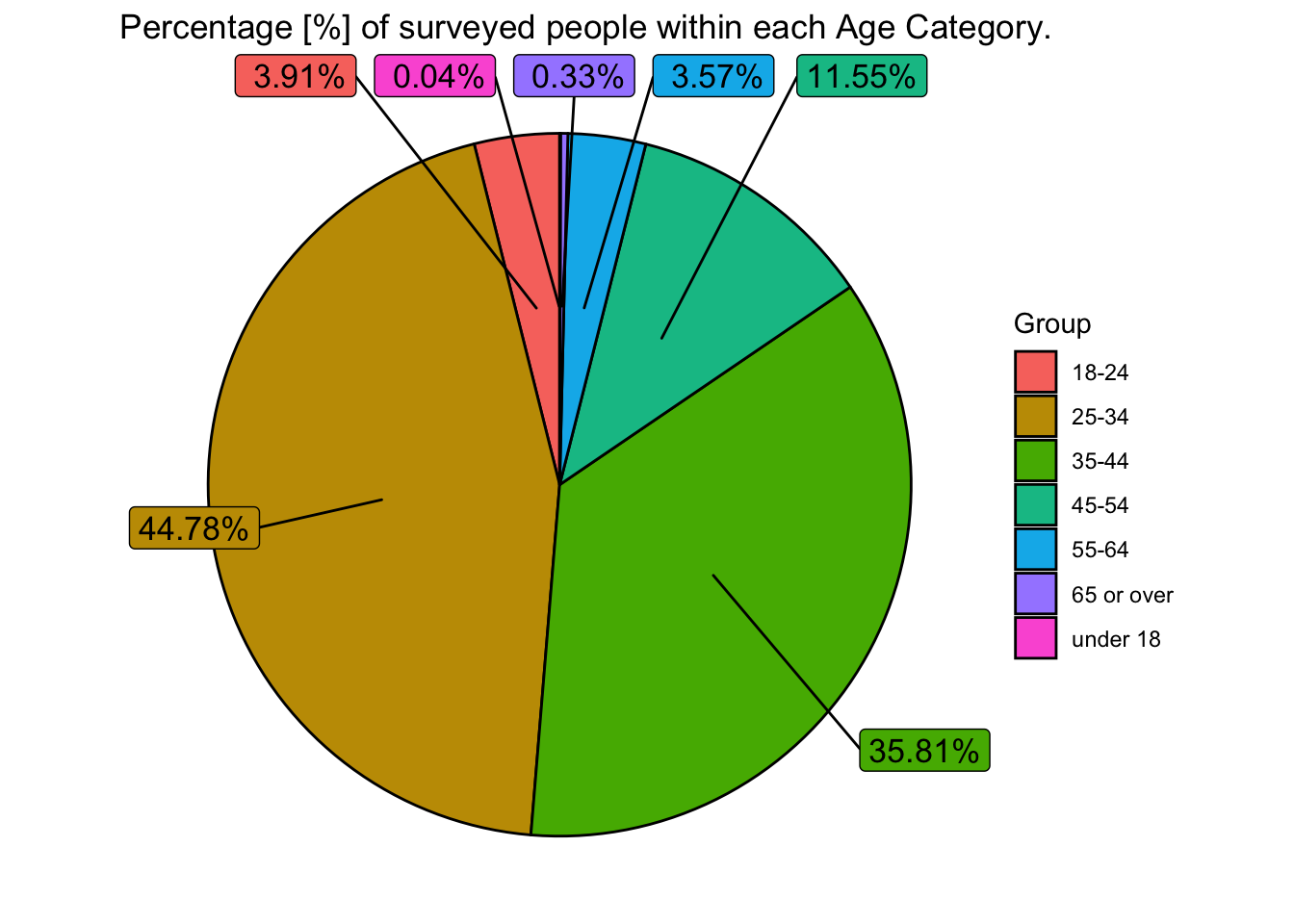
As we can see here, the majority of people surveyed fall into the age bracket of 25-44. Given that ‘managers’ were the target audience of this survey, we would not expect to see many respondents below this age group, and this is confirmed by the chart above. Less than 4% of respondents were under the age of 25. It is however, somewhat surprising that we don’t see as many senior executives (between the ages of 45-64) complete the survey - this is something that we may want to factor into our analysis.
Next we examine the ‘industry’ variable - in this case we plot a bar chart as it makes it easier to visualise the dominant industries.
# We count the number of people in different industries... this time there are too many categories, so we group industries with <1000 workers into 'Other'

prop_industry <- clean_data %>%
  count(industry, na.rm = TRUE)

prop_industry$industry <- ifelse(prop_industry$n < 1000, "Other", prop_industry$industry)
prop_industry2 <- aggregate(prop_industry$n, by=list(industry=prop_industry$industry), FUN=sum)

prop_industry2 <- prop_industry2 %>%
  mutate(percent = 100* x/sum(x))

# Set up data frame for bar chart
df2 <- data.frame(
  Group = prop_industry2$industry,
  Value = prop_industry2$percent
)

df2$Group <- factor(df2$Group, levels = df2$Group[order(df2$Value, decreasing=TRUE)])

df2 %>%
  # Plotting the bar (col) chart
  ggplot(aes(x=Group, y=Value, fill=Group)) +
  geom_col() +
  labs(title="Percentage [%] of surveyed respondents \nwithin each Industry",
       x="Industry",
       y="Percentage [%]",
       fill="Group")+
  theme(axis.text.x = element_text(angle = 45, vjust = 1, hjust=1))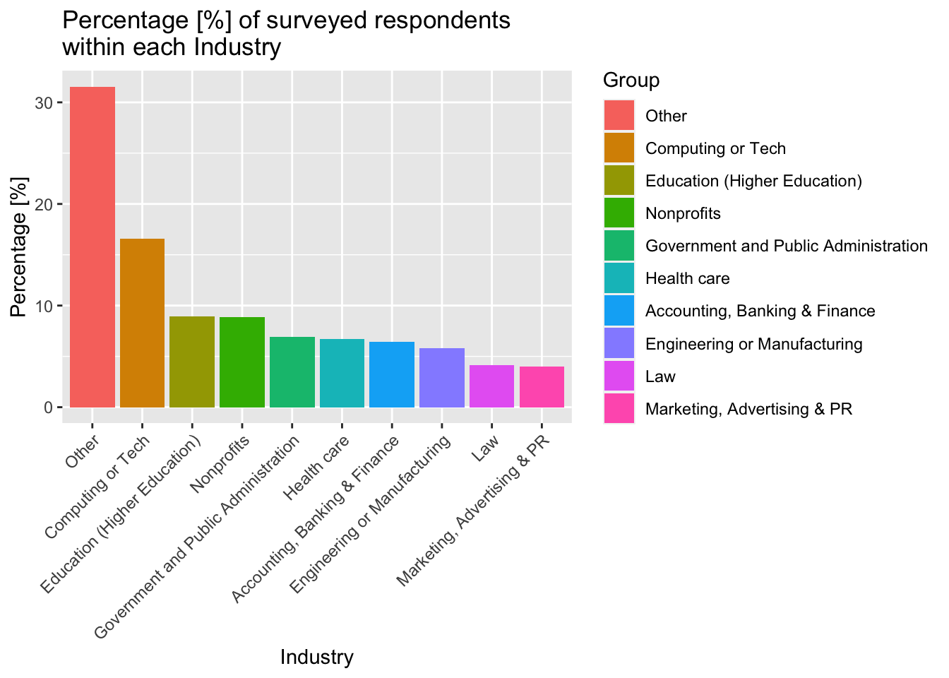
As we can see, there is a fairly balanced distribution of industries, with the most common being Computing/Tech, education and (surprisingly) non-profit. The balanced spread of data between industries should allow for a fairly unbiased comparison of the salaries by industry.
Now we examine the ‘Country’ variable (this is done with a pie chart)…
# We display the country data in a similar way, grouping countries that have less than 200 respondents as 'other'...

prop_country <- clean_data %>%
  count(Country, sort=TRUE, na.rm = TRUE)
prop_country$Country <- ifelse(prop_country$n < 200, "Other", prop_country$Country)

prop_country2 <- aggregate(prop_country$n, by=list(Country=prop_country$Country), FUN=sum)

prop_country2 <- prop_country2 %>%
  mutate(percent = 100* x/sum(x))


df3 <- data.frame(
  Group = prop_country2$Country,
  Value = prop_country2$percent
)

positions3 <- df3 %>%
  mutate(csum3 = rev(cumsum(rev(Value))),
         pos3 = Value/2 + lead(csum3,1),
         pos3 = if_else(is.na(pos3), Value/2, pos3))

#Constructing a pie chart...
ggplot(df3, aes(x="", y=Value, fill=Group))+
  geom_col(width = 1, color = "black")+
  coord_polar(theta = "y") +
  geom_label_repel(data = positions3,
                   aes(y = pos3, label = paste0(format(round(Value,1), nsmall=1), "%")),
                   size = 4.5, nudge_x = 1, show.legend = FALSE) +
  theme_void() +
  labs(title="Percentage [%] of surveyed people within each major Country")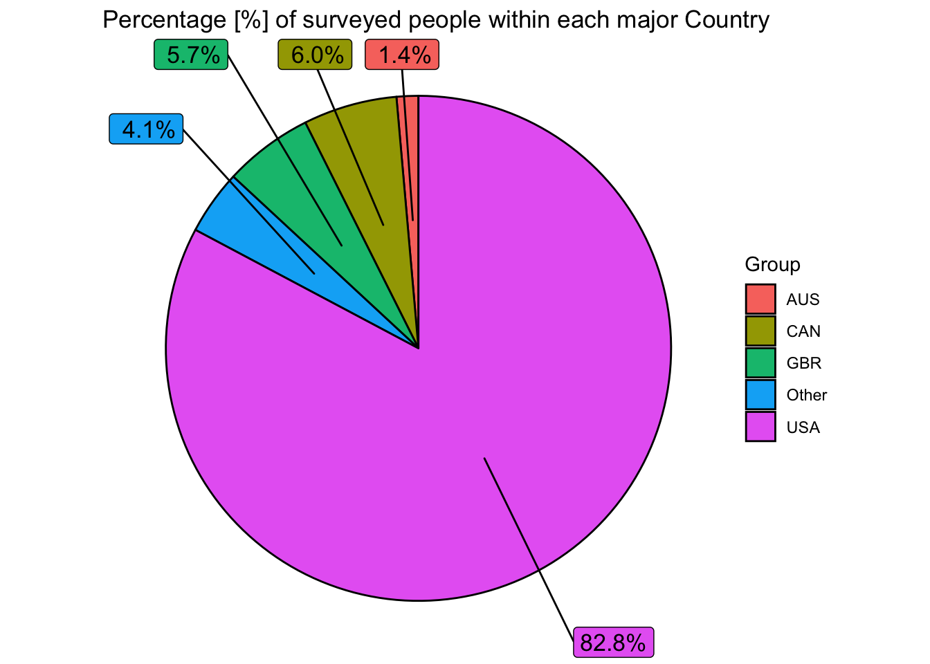
The pie chart above shows that a huge proportion of our respondents come from the United States. This needs to be factored into our analysis, as it is not representative of the global population, and as a result we may see higher-than-expected salary values. In addition, we will be able to make predictions about the USA with greater confidence than we will for other countries. Moreover, almost all of our respondents come from (economically) developed countries.
For the respondents that live in the United States, we can explore the ‘state’ variable. In this case, a bar chart is used as it is easier to visualise the most-inhabited states.
# We repeat this process again to explore the 'state' variable, this time we remove NA's and group states that have less than 600 respondents as 'other'...

prop_state <- clean_data %>%
  filter(state_abb != "NA") %>%
  count(state_abb, sort=TRUE)
prop_state$state_abb <- ifelse(prop_state$n < 600, "Other", prop_state$state_abb)

prop_state2 <- aggregate(prop_state$n, by=list(state_abb=prop_state$state_abb), FUN=sum)
prop_state2 <- prop_state2 %>%
  mutate(percent = 100* x/sum(x))

df4 <- data.frame(
  Group = prop_state2$state_abb,
  Value = prop_state2$percent
)

df4$Group <- factor(df4$Group, levels = df4$Group[order(df4$Value, decreasing=TRUE)])

df4 %>%
  # Plotting the bar (col) chart
  ggplot(aes(x=Group, y=Value, fill=Group)) +
  geom_col() +
  labs(title="Percentage [%] of surveyed respondents (living in America) \nwithin each US State",
       x="State",
       y="Percentage [%]",
       fill="Group")+
  theme(axis.text.x = element_text(angle = 45, vjust = 1, hjust=1))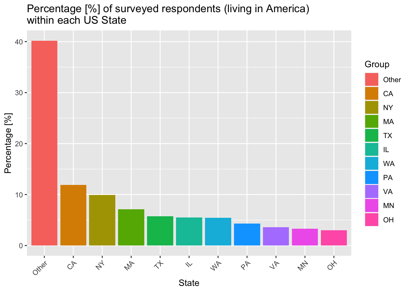
The figure above shows that there is a disproportionate number of respondents living in states such as CA, NY and WA. This is expected however, as these states have some of the largest cities in the USA and some of the better-paid ‘managerial’ jobs.
Now we explore the ‘city’ variable with a bar chart to see which cities have been most-represented.
# Now we explore the 'city' variable... any city with less than 500 people is grouped into 'other'

prop_city <- clean_data %>%
  count(city, sort=TRUE, na.rm = TRUE)
prop_city$city <- ifelse(prop_city$n < 500, "Other", prop_city$city)

prop_city2 <- aggregate(prop_city$n, by=list(city=prop_city$city), FUN=sum)

prop_city2 <- prop_city2 %>%
  mutate(percent = 100* x/sum(x))

df5 <- data.frame(
  Group = prop_city2$city,
  Value = prop_city2$percent
)

positions5 <- df5 %>%
  mutate(csum5 = rev(cumsum(rev(Value))),
         pos5 = Value/2 + lead(csum5,1),
         pos5 = if_else(is.na(pos5), Value/2, pos5))

#Constructing a pie chart...
ggplot(df5, aes(x="", y=Value, fill=Group))+
  geom_col(width = 1, color = "black")+
  coord_polar(theta = "y") +
  geom_label_repel(data = positions5,
                   aes(y = pos5, label = paste0(format(round(Value,1), nsmall=1), "%")),
                   size = 4.5, nudge_x = 1, show.legend = FALSE) +
  theme_void() +
  labs(title="Percentage [%] of surveyed people within different Cities")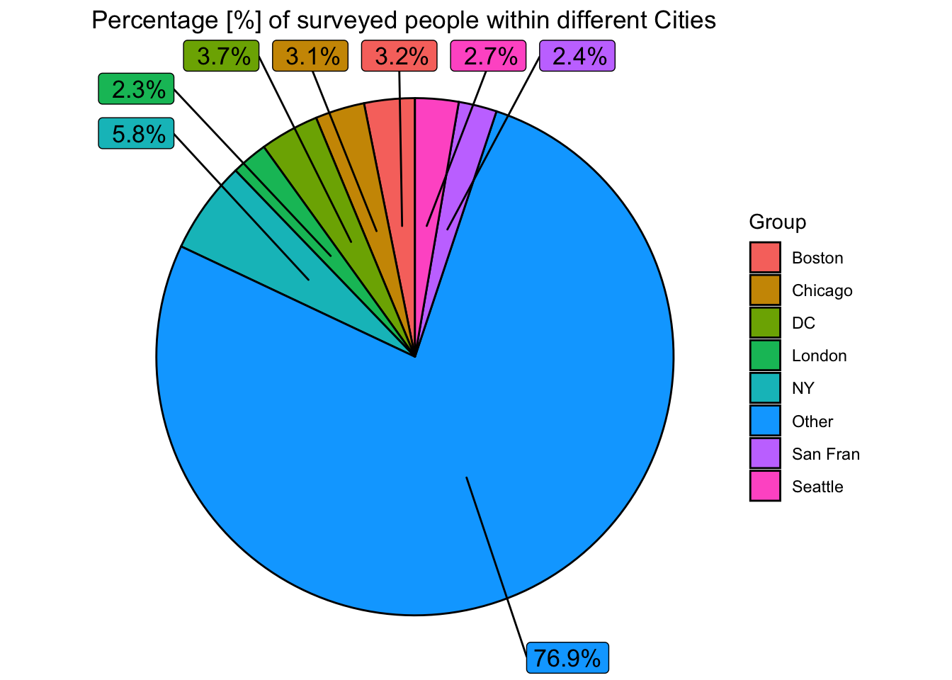
As we can see there is a huge variation in the location (city) of respondents. For this reason, it will be difficult to compare data between cities that are not in the top 5-10 shown above, as there is likely to be insufficient data.
Now we examine the experience levels of our cohort, starting with overall experience…
# We now explore the variable - 'overall_years_of_experience' - we analyse this with a bar chart.
prop_totalexp <- clean_data %>%
  count(overall_years_of_professional_experience) %>%
  mutate(percent = 100* n/sum(n))

df6 <- data.frame(
  Group = prop_totalexp$overall_years_of_professional_experience,
  Value = prop_totalexp$percent
)

order <- c("1 year or less","2 - 4 years","5-7 years","8 - 10 years","11 - 20 years","21 - 30 yeaars","31 - 40 years","41 years or more")

df6$Group = factor(c("1 year or less","11 - 20 years","2 - 4 years","21 - 30 yeaars","31 - 40 years","41 years or more","5-7 years","8 - 10 years"),levels = order)

df6 %>%
  ggplot(aes(x=Group, y=Value, fill=Group)) +
  geom_col() +
  labs(title="Percentage [%] of people within each category of \nOVERALL experience level",
       x="Experience Level",
       y="Percentage [%]",
       fill="Group")+
  theme(axis.text.x = element_text(angle = 45, vjust = 1, hjust=1))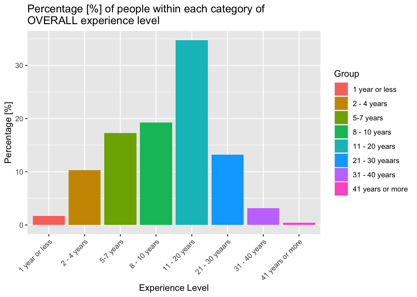
This graph above shows that the majority of our respondents have less than 20 years experience. This makes sense given the average age of our respondents is typically between 25 and 44. As mentioned previously, we have very few respondents that are senior executives over the age of 45.
Now, we analyse experience within the respondent’s given field…
# We now explore the variable - 'years of experience within specific field' ...
prop_fieldexp <- clean_data %>%
  count(years_of_experience_in_field) %>%
  mutate(percent = 100* n/sum(n))

df7 <- data.frame(
  Group = prop_fieldexp$years_of_experience_in_field,
  Value = prop_fieldexp$percent
)

order <- c("1 year or less","2 - 4 years","5-7 years","8 - 10 years","11 - 20 years","21 - 30 yeaars","31 - 40 years","41 years or more")

df7$Group = factor(c("1 year or less","11 - 20 years","2 - 4 years","21 - 30 yeaars","31 - 40 years","41 years or more","5-7 years","8 - 10 years"),levels = order)

df7 %>%
  ggplot(aes(x=Group, y=Value, fill=Group)) +
  geom_col() +
  labs(title="Percentage [%] of people within each category of \nSECTOR-SPECIFIC experience level",
       x="Experience Level",
       y="Percentage [%]",
       fill="Group")+
  theme(axis.text.x = element_text(angle = 45, vjust = 1, hjust=1))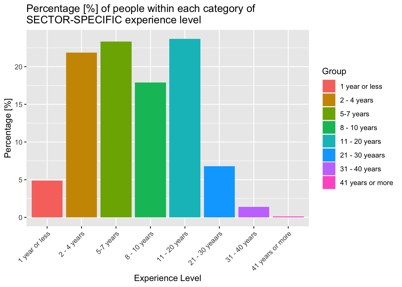
Here we see that almost nobody has more than 20 years of sector specific experience - once again we expect these results, as the average number of years of sector specific experience should almost certainly be less than the average number of years of total experience.
Now, we can compare the education levels of our cohort (once again using a bar chart).
# Education Level ...
prop_education <- clean_data %>%
  count(highest_level_of_education_completed) %>%
  mutate(percent = 100* n/sum(n))

df8 <- data.frame(
  Group = prop_education$highest_level_of_education_completed,
  Value = prop_education$percent
)

#We abbreviate "Professional Degree (MD, JD, etc.)" to "Prof. Degree" because it takes up too much space on the chart!
df8$Group[6] <- "Prof. Degree"

order <- c("NA","High School","Some college","College Degree","Master's Degree","Prof. Degree","PhD")

df8$Group = factor(c("College Degree","High School","Master's Degree","PhD","Prof. Degree","Some college","NA"),levels = order)

df8 %>%
  ggplot(aes(x=Group, y=Value, fill=Group)) +
  geom_col() +
  labs(title="Percentage [%] of people within each category of Education level",
       x="Education Level",
       y="Percentage [%]",
       fill="Group")+
  theme(axis.text.x = element_text(angle = 45, vjust = 1, hjust=1))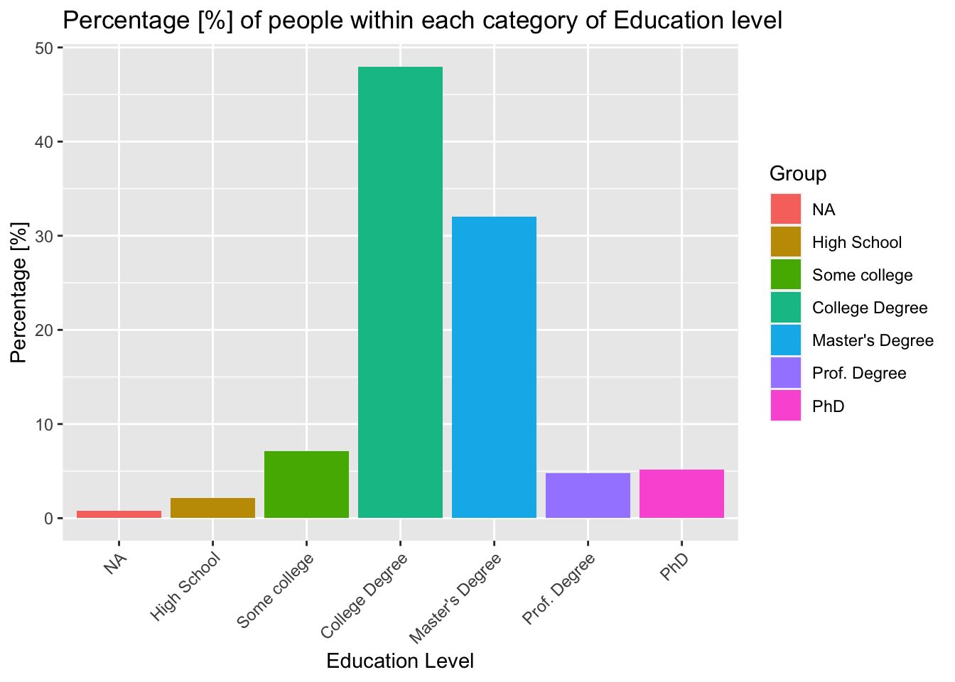
The results for education highlight the fact that a disproportionate number of our respondents hold some form of degree (Master’s, College or Professional). This is not representative of the global population, or even the population of the United States. This bias is expected within the data, as the survey is targeted towards people in ‘managerial’ roles - typically, we would expect these people to be more likely to have a degree.
Now we can analyse the variable ‘gender’ - this variable is more simple and can therefore be illustrated more effectively with a pie chart.
# Gender ...
prop_gender <- clean_data %>%
  filter(gender != "NA") %>%
  count(gender) %>%
  mutate(percent = 100* n/sum(n))

df9 <- data.frame(
  Group = prop_gender$gender,
  Value = prop_gender$percent
)

positions9 <- df9 %>%
  mutate(csum9 = rev(cumsum(rev(Value))),
         pos9 = Value/2 + lead(csum9,1),
         pos9 = if_else(is.na(pos9), Value/2, pos9))

#Constructing a pie chart...
ggplot(df9, aes(x="", y=Value, fill=Group))+
  geom_col(width = 1, color = "black")+
  coord_polar(theta = "y") +
  geom_label_repel(data = positions9,
                   aes(y = pos9, label = paste0(format(round(Value,1), nsmall=1), "%")),
                   size = 4.5, nudge_x = 1, show.legend = FALSE) +
  theme_void() +
  #guides(fill = guide_legend(title = "Group")) +
  labs(title="Percentage [%] of respondents in each Gender category")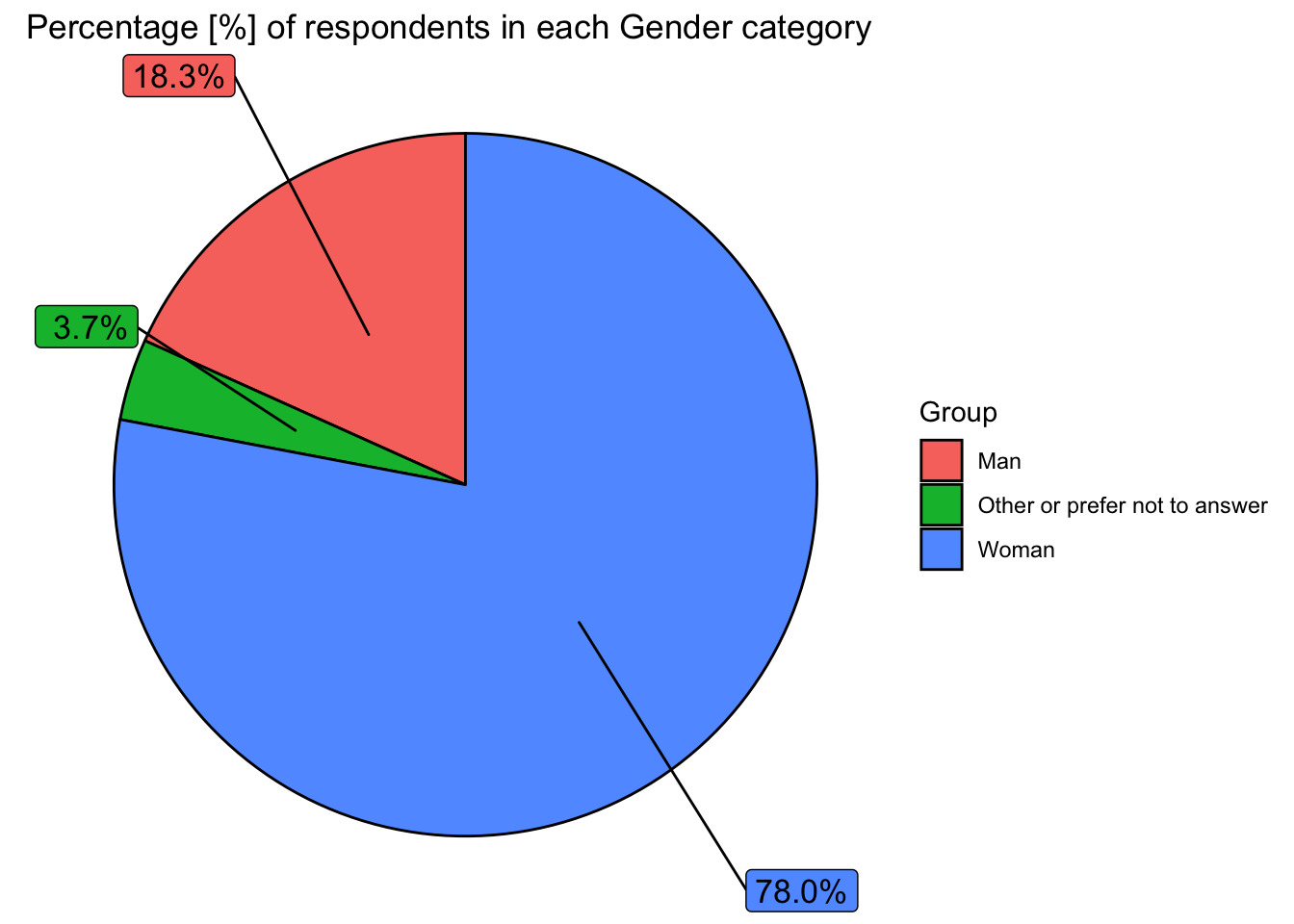
As this survey is targeted towards females, we have a particularly biased data set when it comes to gender. This is important to consider.
Finally, we can analyse the ‘race’ variable.
# Finally, we explore the variable 'race' - in this instance, we group any ethnicity with n < 200 as 'Other'...

prop_race <- clean_data %>%
  count(race, sort=TRUE, na.rm = TRUE)
prop_race$race <- ifelse(prop_race$n < 200, "Other", prop_race$race)
prop_race$race <- ifelse(prop_race$race == "Another option not listed here or prefer not to answer", "Other", prop_race$race)

prop_race2 <- aggregate(prop_race$n, by=list(race=prop_race$race), FUN=sum)

prop_race2 <- prop_race2 %>%
  mutate(percent = 100* x/sum(x))

df10 <- data.frame(
  Group = prop_race2$race,
  Value = prop_race2$percent
)

positions10 <- df10 %>%
  mutate(csum10 = rev(cumsum(rev(Value))),
         pos10 = Value/2 + lead(csum10,1),
         pos10 = if_else(is.na(pos10), Value/2, pos10))

#Constructing a pie chart...
ggplot(df10, aes(x="", y=Value, fill=Group))+
  geom_col(width = 1, color = "black")+
  coord_polar(theta = "y") +
  geom_label_repel(data = positions10,
                   aes(y = pos10, label = paste0(format(round(Value,1), nsmall=1), "%")),
                   size = 4.5, nudge_x = 1, show.legend = FALSE) +
  theme_void() +
  labs(title="Percentage [%] of surveyed people within different Ethnicity groups")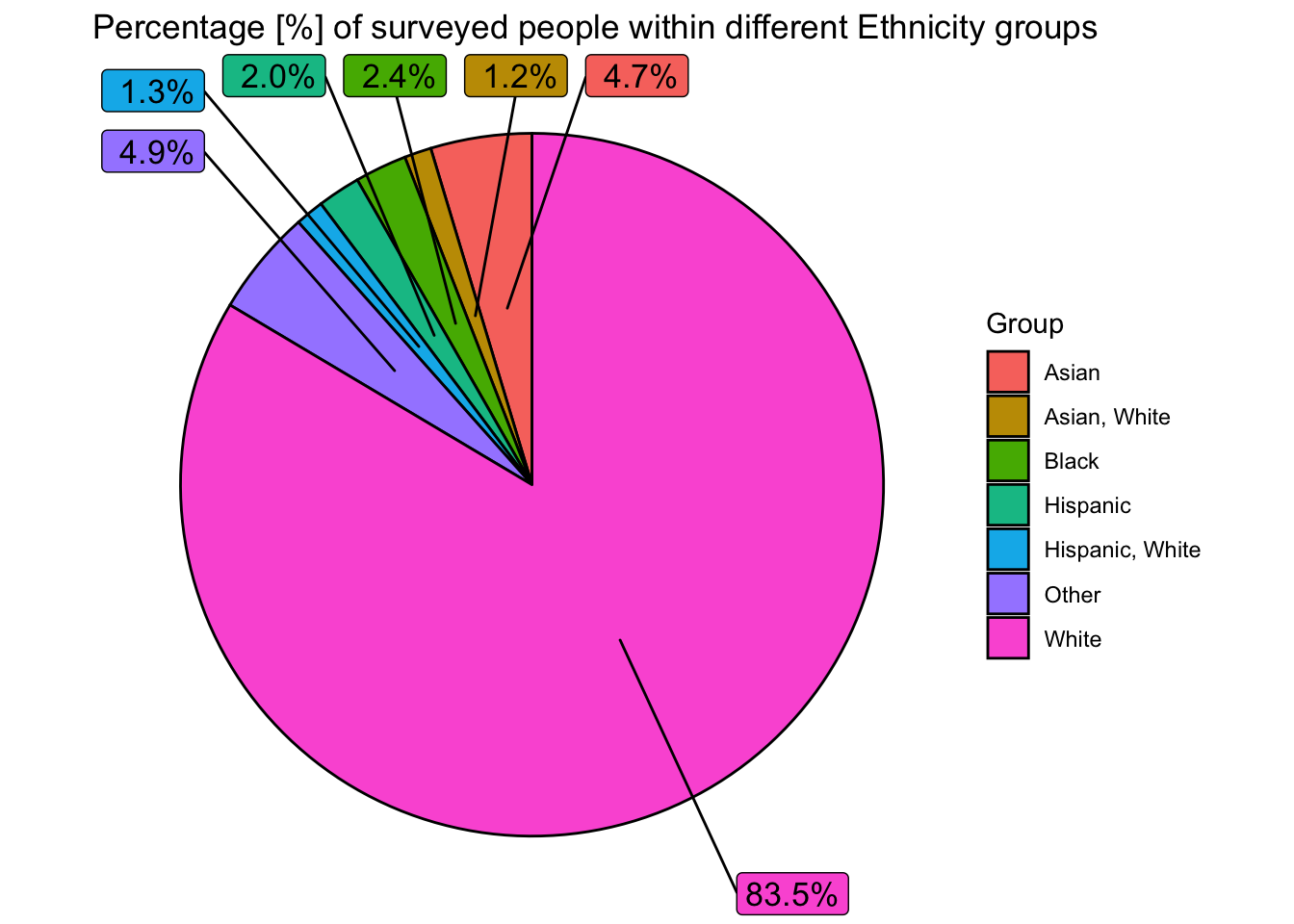
Here, we can see that a disproportionate number of people surveyed are White. Around 75% of people in the USA are white, and as the USA is the most surveyed country, we expect the proportion of white people to be large. The proportion of white people however, is still slightly higher than we would expect (particularly when considering the other countries surveyed) - and this could perhaps highlight a structural preference towards white people in the work place (for executive managerial jobs) in the United States.
The analysis above has highlighted some of the bias in our dataset that needs to be considered in our analysis. We have a disproportionately high number of females, as well as biases towards white people, college educated people, people who live in the United States and people in the 25-44 age group. This bias can generally be explained by the target audience of the “Ask A Manager” survey itself (which focused on females in managerial roles), but this needs to be considered in the analysis of this data set.
Section 2.1 - Exploring the dependent variable and its relations.
Now that we have explored the independent variables sufficiently, we can begin exploring the dependent variable, which is the ‘average annual salary in USD [$]’. This analysis will be continued into section 3, where we will use confidence intervals and perform hypothesis tests to determine which independent variables have the greatest affect on salary.
For now, we can do some initial plots of the dependent variable, to see how it may be distributed and what it may be most affected by.
We begin with a density plot of the total annual earnings (in USD) using a logarithmic scale.
ggplot(clean_data, aes(x=tot_earnings_USD))+
  geom_density(fill="dodgerblue", alpha=0.5)+
  scale_x_log10()+
  labs(title="Density Plot for Average Annual Earnings in USD [$]", subtitle = "Plotted using a logarithmic scale", x="Average Annual Earnings in USD [$]", y="Density")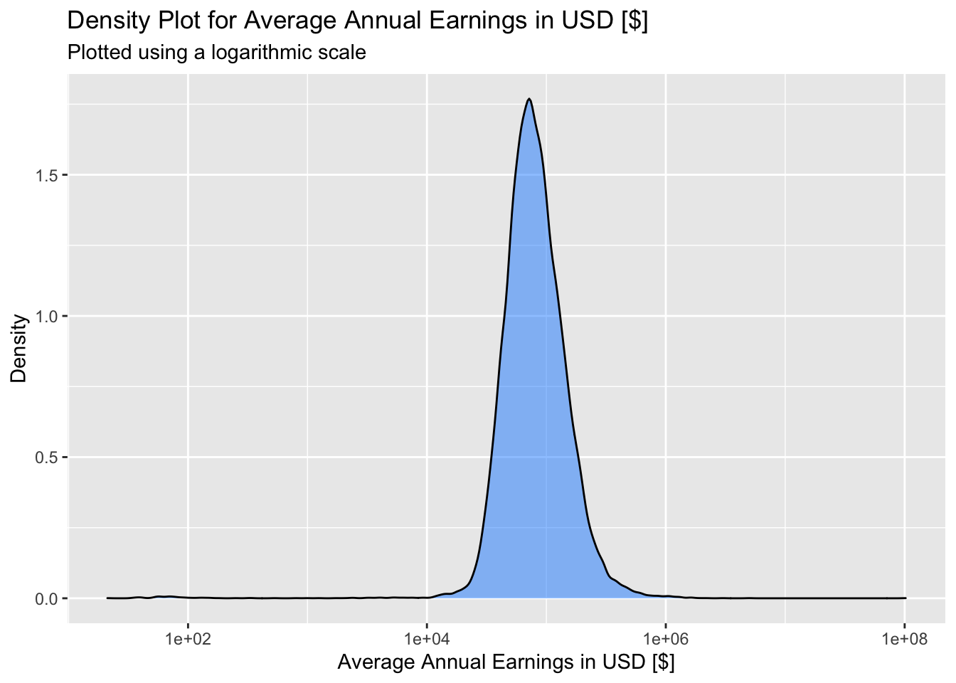
#The mean average annual salary in USD is as follows:
mean(clean_data$tot_earnings_USD)
## [1] 101137When we plot the distribution of average annual earnings on a logarithmic scale, we obtain what looks like a normal distribution. This means that average annual earnings can likely be approximated with a log-normal distribution, and also that, if we plotted earnings on a normal (non-logarithmic) scale, the distribution would be very positively skewed. This is expected, as salary is generally a positively skewed distribution, as there are typically very large positive outliers far beyond the average value.
We can now begin investigating how salary might be influenced by different factors, starting with industry. We plot the average salary by industry (for the best paid industries) shown below.
industry_salary <- clean_data %>%
  select(industry, tot_earnings_USD)

agg_industry_salary <- aggregate(tot_earnings_USD ~ industry, industry_salary, mean)
agg_industry_salary <- agg_industry_salary[with(agg_industry_salary,order(-tot_earnings_USD)),]
agg_industry_salary <- agg_industry_salary[1:8,]

agg_industry_salary$industry <- factor(agg_industry_salary$industry, levels = agg_industry_salary$industry[order(agg_industry_salary$tot_earnings_USD, decreasing=TRUE)])

agg_industry_salary %>%
  # Plotting the bar (col) chart
  ggplot(aes(x=industry, y=tot_earnings_USD, fill=industry)) +
  geom_col() +
  labs(title="Average Salary per Industry for the Top 8 \nhighest earning Industries",
       x="Indusry",
       y="Average Annual Salary USD [$]",
       fill="Group")+
  theme(axis.text.x = element_text(angle = 45, vjust = 1, hjust=1))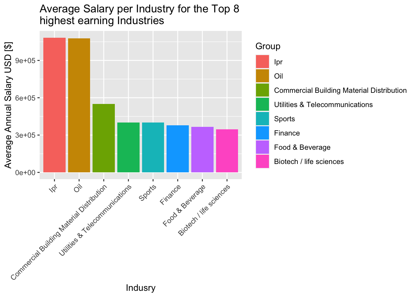
Evidently, there will be a large discrepancy in pay between industries. This is something we can analyse more in the following section (3) with statistical tests.
Finally, we can use our data to see if there is a salary discrepancy between males and females. We do this by taking the average salary of males and females in our survey and plotting this on a bar graph.
gender_salary <- clean_data %>%
  select(gender, tot_earnings_USD)

agg_gender_salary <- aggregate(tot_earnings_USD ~ gender, gender_salary, mean)
agg_gender_salary <- agg_gender_salary[with(agg_gender_salary,order(-tot_earnings_USD)),]

agg_gender_salary$gender[3] <- "Other"

agg_gender_salary$gender <- factor(agg_gender_salary$gender, levels = agg_gender_salary$gender[order(agg_gender_salary$tot_earnings_USD, decreasing=TRUE)])

agg_gender_salary %>%
  # Plotting the bar (col) chart
  ggplot(aes(x=gender, y=tot_earnings_USD, fill=gender)) +
  geom_col() +
  labs(title="Average Salary per Gender",
       x="Gender",
       y="Average Annual Salary USD [$]",
       fill="Group")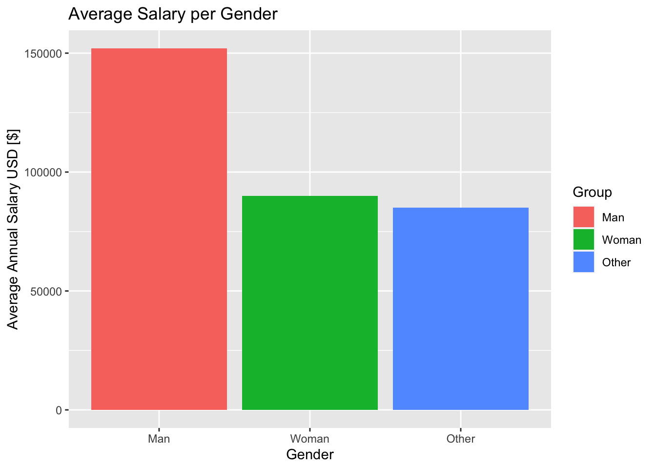
These results would indicate that there is a gender pay gap, but we need to conduct hypothesis tests to confirm this assumption. We will delve deeper into the data and conduct hypothesis tests in the following section.
Section 3 - Analysis using Confidence Intervals and Hypothesis Testing.
Section 3.1 Gender pay inequality accross age groups in UK
First, let’s look at the gender pay gap within UK for each age groups.
#prepare dataframe for comparison
pay_gender_uk <- clean_data %>%
filter(Country == "GBR") %>%
select(how_old_are_you, gender, tot_earnings_USD) %>%
filter(gender=="Woman" | gender=="Man") %>%
group_by(how_old_are_you, gender) %>%
summarise(mean_pay = mean(tot_earnings_USD)) %>%
pivot_wider(names_from = gender,
values_from = mean_pay) %>%
mutate(pay_gap = Man - Woman)
pay_gender_uk %>%
ggplot(aes(x=how_old_are_you, y=pay_gap, fill=how_old_are_you)) +
geom_col() +
labs(title="Gender pay gap within UK for each age groups",
x="Age group",
y="Pay gap (men's - women's)",
fill="Age group")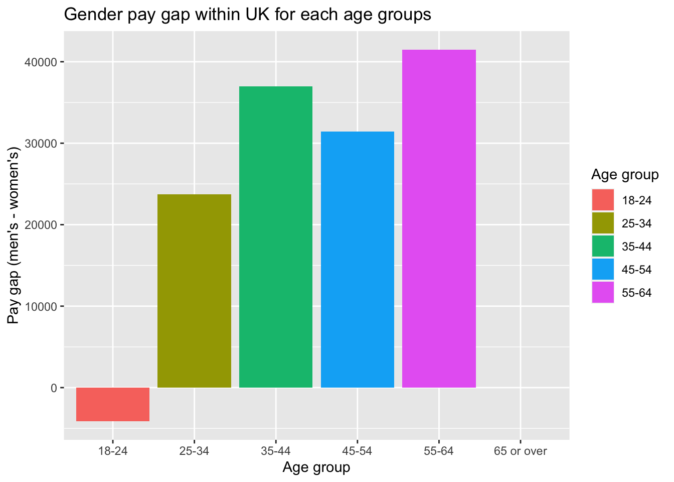 The graph exhibits that men earns more than women across all age groups. This is probably because of the fact that males take more senior roles than females as these jobs is highly associated with high working hours, which has been shown to be inherently gendered (Gascoigne et al. 2015).
And it seems that throughout the lifetime, as people grow older, the gender pay gap becomes more significant except for age group 45-54. - Women seems to be earning more than men for the age group 18-24. - The gap continues to increase. This is probably because that women take up more caring responsibilities for children and have more part-time jobs as they grow older. However, we - For age group 45-54, the result seems to be unexpected, therefore we look a bit further as follows.
#prepare the dataframe for the violin plot
var_gender_uk <- clean_data %>%
  filter(Country == "GBR") %>%
  select(how_old_are_you, gender, tot_earnings_USD) %>%
  filter(gender=="Woman" | gender=="Man") %>%
  mutate(tot_earnings_USD_log = log(tot_earnings_USD))

#make violin plot
var_gender_uk %>%
  ggplot(aes(x=how_old_are_you,
             y=tot_earnings_USD_log,
             color=how_old_are_you)) +
  geom_violin()+
  geom_boxplot(width=0.1)+
  stat_summary(fun.y=median, geom="point", size=2, color="red") +
  stat_summary(aes(y = tot_earnings_USD_log,group=1), fun.y=median, colour="red", geom="line",group=1) +
  facet_wrap(~gender) +
  theme(legend.position="bottom") +
  labs(title = "Violin plot for salary in each age group for each gender",
       x = "Age group",
       y = "Total earnings",
       color = "Age group")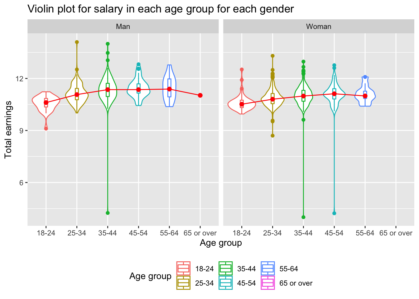
Based on the violin plot, we can see that for men, they reach their peak earning ability during age 35-44, and they earn more or less the same throughout years until they reach 60s, when their earning begins to slide down. Whereas women reach theirs during age 45-54, and immediately slide down in the coming age group. This pattern explains why we got the somewhat unexpected result from the previous plot for age 45-54.
The gender pay gap is relatively small for the age group 18-24. This is probably because nowdays women receive similar education and enter similar early career as men. But is it statistically significant? We will look at the following.
Do UK men earn statistically more than women in age group 18-24?
In this case, our null hypothesis is that the mean of earnings between man and woman are the same.
\(H_0: \overline{x_1} = \overline{x_2}\)
First, let’s produce and take a look at the density chart.
#prepare dataframe for comparison
salary_gender_uk <- clean_data %>%
  filter(Country == "GBR" & how_old_are_you=="18-24") %>%
  select(how_old_are_you, gender, tot_earnings_USD) %>%
  filter(gender=="Woman" | gender=="Man")

#add index column for each of the rows and take log for earnings
salary_gender_uk$ID <- seq.int(nrow(salary_gender_uk))
salary_gender_uk <- salary_gender_uk %>%
  mutate(tot_earnings_USD_log = log(tot_earnings_USD))

#prepare gender comparison by converting long table to wide table
salary_gender_uk_wider <- salary_gender_uk %>%
  pivot_wider(names_from = gender,
              values_from = tot_earnings_USD_log)

#calculate the mean for each of the gender group
mean_woman <- salary_gender_uk_wider %>%
  filter(!is.na(Woman)) %>%
  pull(Woman) %>%
  mean()
mean_man <- salary_gender_uk_wider %>%
  filter(!is.na(Man)) %>%
  pull(Man) %>%
  mean()

#make mirror density chart
salary_gender_uk_wider %>% ggplot(aes(x=x) ) +
  # Top for woman
  geom_density(aes(x = Woman, y = ..density..), fill="#69b3a2", alpha = 0.3) +
  geom_label( aes(x=4.5, y=0.25, label="Woman"), color="#69b3a2") +

  # Bottom for man
  geom_density( aes(x = Man, y = -..density..), fill= "#404080", alpha = 0.3) +
  geom_label( aes(x=4.5, y=-0.25, label="Man"), color="#404080") +

  #Add mean point for both gender groups
  geom_point(aes(x=mean_woman, y=0.01), size=1.5, colour="#69b3a2")+
  geom_point(aes(x=mean_man, y=-0.01), size=1.5, colour="#404080")+
  labs(title = "Mirror density plot of the two gender groups in age 18-24 in UK",x = "Log of salary", y = "Density")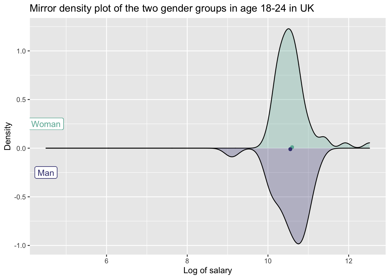
We can see from the mirror density chart above that the density chart for man is more left-skewed than that for woman. And the mean of log salary for woman is higher. However, is it statistically significant that on average, men earn significantly differently from women in this age group? Let’s produce and look at the confidence intervals plot.
#calculate man and woman confidence intervals for the age group 18-24
salary_gender_comparison <- salary_gender_uk %>%
  group_by(gender) %>%
  summarise(mean_salary = mean(tot_earnings_USD_log),
            sd_salary = sd(tot_earnings_USD_log, na.rm=TRUE),
            count_salary = n(),
            se_salary = sd_salary / sqrt(count_salary),
            ci_salary_up = mean_salary + qt(.975, count_salary-1)*se_salary,
            ci_salary_dw = mean_salary - qt(.975, count_salary-1)*se_salary
            )

#plot the confidence intervals in a graph
salary_gender_comparison %>%
  ggplot(aes(x=mean_salary, y=gender, color=gender))+
    geom_rect(fill="grey",alpha=0.5, color = "grey",
            aes(xmin=max(ci_salary_dw),
                xmax=min(ci_salary_up),
                ymin=-Inf,
                ymax=Inf))+
  geom_errorbarh(aes(xmin=ci_salary_dw,xmax=ci_salary_up))+
  geom_point(aes(x=mean_salary, y=gender), size=3)+
  geom_text(aes(label=round(mean_salary, digits=2)), vjust = -1.5)+
  labs(title="Do UK woman aged 18-24 earn more than woman in the same age group?",
       subtitle = "95% confidence intervals overlap",
       x = "Mean log of annual earnings",
       y = "Gender",
       color="Gender")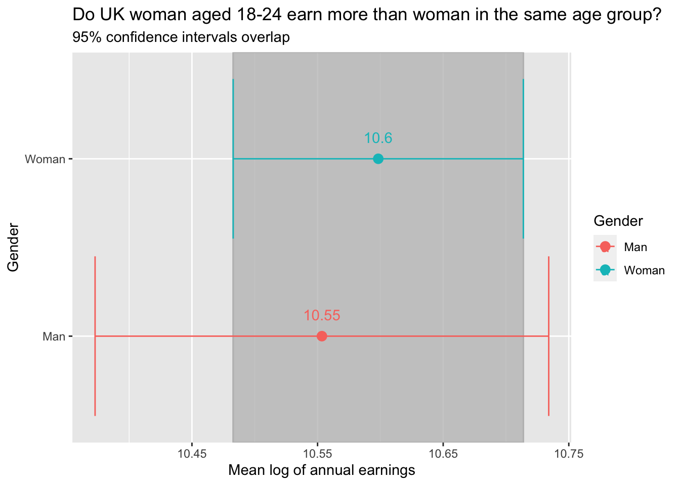
From the graph we can see that the confidence intervals overlap. This way we cannot reject the null hypotheses \(H_0\) and therefore the below t-test will be performed.
#calculate the t-stats for gender pay gap in the age group of 18-24
t.test(tot_earnings_USD_log ~ gender, data = salary_gender_uk)
##
## Welch Two Sample t-test
##
## data: tot_earnings_USD_log by gender
## t = -0.42754, df = 47.345, p-value = 0.6709
## alternative hypothesis: true difference in means between group Man and group Woman is not equal to 0
## 95 percent confidence interval:
## -0.2559324 0.1662017
## sample estimates:
## mean in group Man mean in group Woman
## 10.55346 10.59832We can see that the \(|t-stat| < 2\) and \(|p-value| > 0.05\). We still cannot reject the null hypothesis \(H_0\) and therefore UK males aged between 18-24 do not earn significantly higher than women in the same age group.
Section 3.2 Gender pay inequality across industries in US
#top 10 industries in US
top_10_industry <- clean_data %>%
  filter(Country == "USA") %>%
  group_by(industry) %>%
  count() %>%
  arrange(-n) %>%
  head(30) %>%
  select(industry)

#prepare dataframe for comparison
top_10_clean_data <- top_10_industry %>%
  left_join(clean_data, by="industry") %>%
  filter(Country == "USA") %>%
  filter(gender == "Man" | gender == "Woman") %>%
  mutate(tot_earnings_USD_log = log(tot_earnings_USD)) %>%
  filter(tot_earnings_USD_log>0)

pay_industry_us <- top_10_clean_data %>%
  select(industry, gender, tot_earnings_USD_log) %>%
  group_by(industry, gender) %>%
  summarise(mean_pay = mean(tot_earnings_USD_log)) %>%
  pivot_wider(names_from = gender,
              values_from = mean_pay) %>%
  mutate(pay_gap = Woman - Man) %>%
  #select the industries where women earn more than men
  filter(pay_gap > 0)

#plot the graph
pay_industry_us %>%
  ggplot(aes(x=reorder(industry,pay_gap), y=pay_gap, fill=industry)) +
  geom_col() +
  labs(title="Industries where women are paid more than men",
       x="Industry",
       y="Pay gap (women's - men's)",
       fill="Industry") +
  theme(legend.position="right") +
  coord_flip()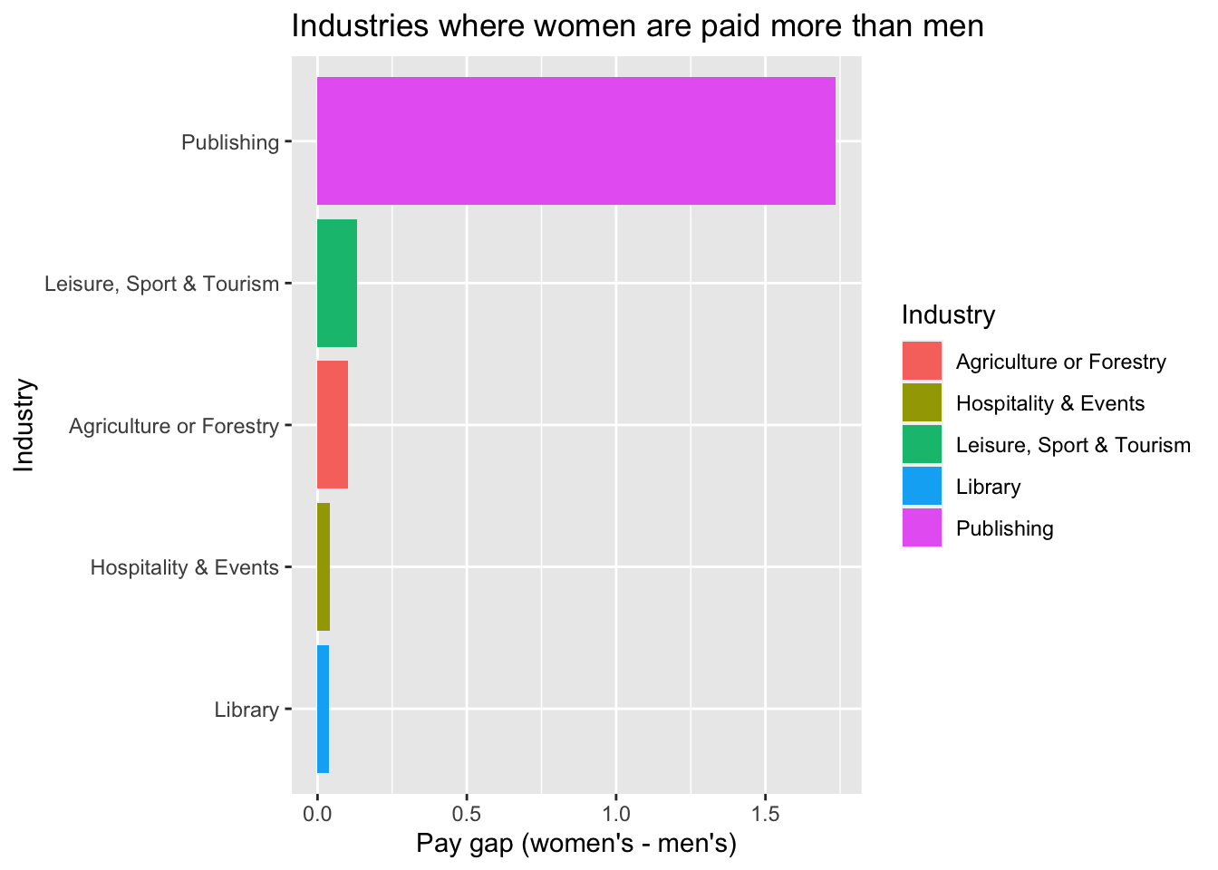
Based on the graph, we can see that in the “Publishing” industry, the pay gap is the most significant among top industries where most people work in. But is it statistically significant? Let’s look at the following.
Do US women earn statistically more than men in Publishing sector?
In this case, our null hypothesis is that the mean of earnings between man and woman are the same.
\(H_0: \overline{x_1} = \overline{x_2}\)
#calculate the log
pub_gender_uk <- top_10_clean_data %>%
  filter(industry == "Publishing")

#calculate man and woman confidence intervals for the age group 18-24
ci_pub_gender_uk <- pub_gender_uk %>%
  group_by(gender) %>%
  summarise(mean_salary = mean(tot_earnings_USD_log),
            sd_salary = sd(tot_earnings_USD_log, na.rm=TRUE),
            count_salary = n(),
            se_salary = sd_salary / sqrt(count_salary),
            ci_salary_up = mean_salary + qt(.975, count_salary-1)*se_salary,
            ci_salary_dw = mean_salary - qt(.975, count_salary-1)*se_salary
            )

#plot the confidence intervals in a graph
ci_pub_gender_uk %>%
  ggplot(aes(x=mean_salary, y=gender, color=gender))+
    geom_rect(fill="grey",alpha=0.5, color = "grey",
            aes(xmin=max(ci_salary_dw),
                xmax=min(ci_salary_up),
                ymin=-Inf,
                ymax=Inf))+
  geom_errorbarh(aes(xmin=ci_salary_dw,xmax=ci_salary_up))+
  geom_point(aes(x=mean_salary, y=gender), size=3)+
  geom_text(aes(label=round(mean_salary, digits=2)), vjust = -1.5)+
  labs(title="Do US women earn more than men in the Publishing sector?",
       subtitle = "95% confidence intervals overlap",
       x = "Mean log of annual earnings",
       y = "Gender",
       color="Gender")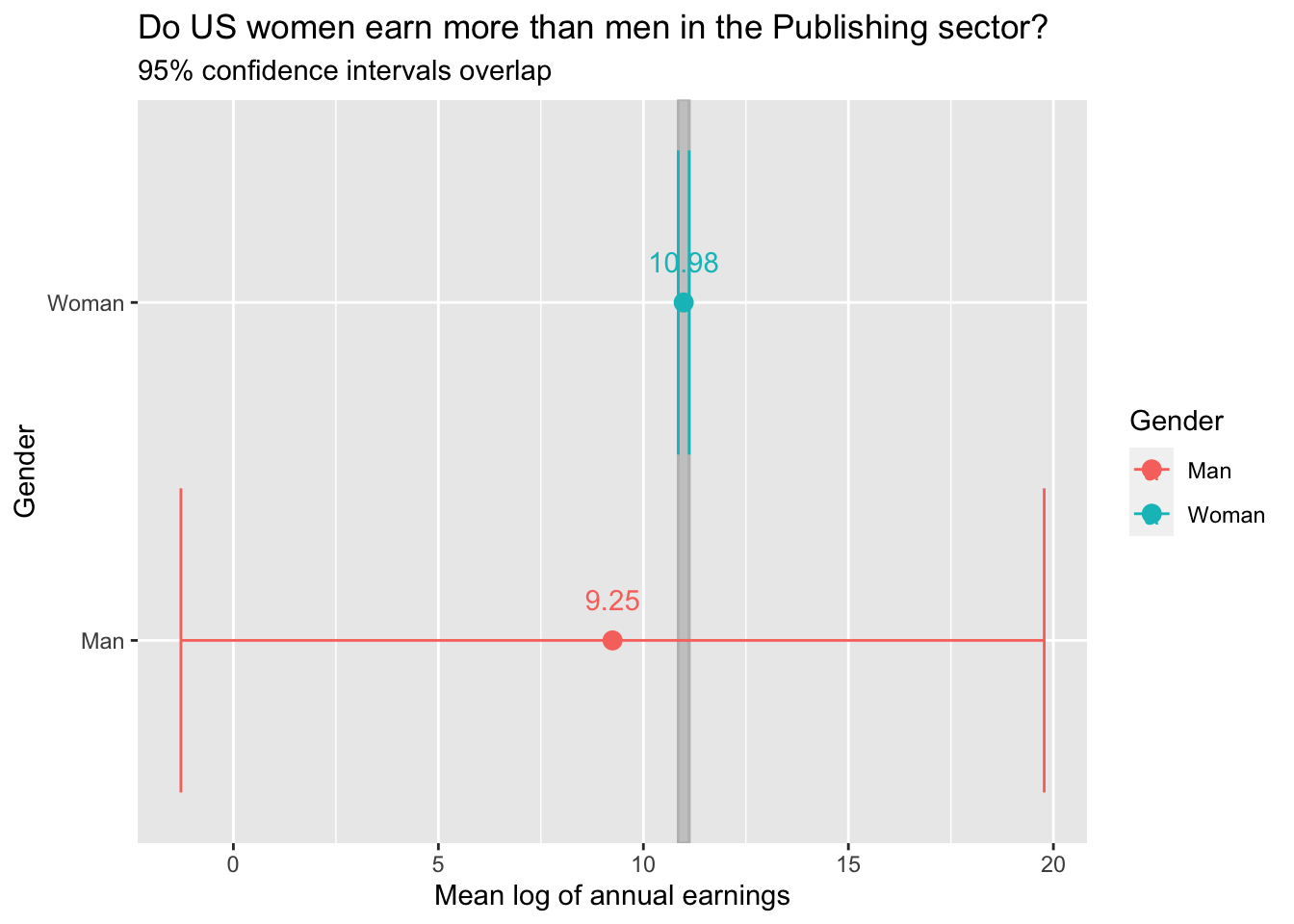
From the graph we can see that the confidence intervals overlap. This way we cannot reject the null hypotheses \(H_0\) and therefore the below t-test will be performed.
#calculate the t-stats for gender pay gap in the hospitality and events industry
t.test(tot_earnings_USD_log ~ gender, data = pub_gender_uk)
##
## Welch Two Sample t-test
##
## data: tot_earnings_USD_log by gender
## t = -0.70891, df = 2.0029, p-value = 0.5518
## alternative hypothesis: true difference in means between group Man and group Woman is not equal to 0
## 95 percent confidence interval:
## -12.251797 8.781525
## sample estimates:
## mean in group Man mean in group Woman
## 9.248224 10.983360We can judge from above results that we cannot reject the null hypothesis \(H_0\). Therefore, although on average, women earn more than men in “Publishing” sector, it is still not significant that men and women earn differently in statistical sense.
Section 3.3 Race vs. total earnings
Now we will investigate on the relationship between race and their earnings.
clean_data %>%
#Filter out the outliers
filter(tot_earnings_USD<300000) %>%
drop_na(race) %>%
#Here the mixed races are not taken into account
filter(race == c("White","Black","Hispanic","Asian")) %>%
ggplot(aes(x = tot_earnings_USD,
y = fct_reorder(race,tot_earnings_USD)))+
geom_boxplot()+
labs(title = "Total earning of different races",
subtitle = "for people with earnings ranged from 0 to 300000 USD",
x = "Total earnings in USD",
y = "Race")+
theme_bw()+
NULL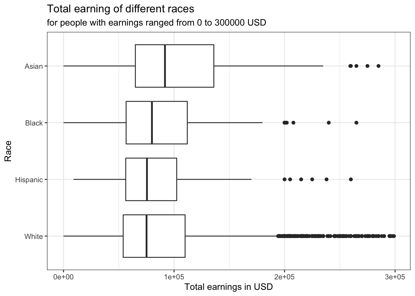 Some statistical results calculated using formula…
earning_race <- clean_data %>%
  filter(race == c("White","Black","Hispanic","Asian")) %>%
  # Outlier
  filter(tot_earnings_USD < 10000000) %>%
  group_by(race) %>%
  summarise (mean = mean(tot_earnings_USD), SD = sd(tot_earnings_USD), sample_size = n()) %>%
  mutate(se = sqrt(SD^2/sample_size), t_value = qt(p=.05/2, df=sample_size-1, lower.tail=FALSE),
         margin_of_error = t_value*se, earning_low = mean-t_value*se, earning_high = mean+t_value*se)

earning_race
## # A tibble: 4 × 9
## race mean SD sample_size se t_value margin_of_error earning_low
## <chr> <dbl> <dbl> <int> <dbl> <dbl> <dbl> <dbl>
## 1 Asian 113566. 84942. 315 4786. 1.97 9417. 104150.
## 2 Black 97037. 55606. 155 4466. 1.98 8823. 88214.
## 3 Hispanic 102101. 94705. 136 8121. 1.98 16061. 86041.
## 4 White 95816. 80617. 5587 1079. 1.96 2114. 93701.
## # … with 1 more variable: earning_high <dbl>It can be seen here that Hispanic people have the highest mean earning while White people have the lowest. However, the sample size of White is a lot larger than the other ones, which makes its statistics more predictive. As for the difference in earnings among these race groups, it can be explained by the fact that the Asian and Hispanic who filled this survey are most likely foreign employees in the US, as the majority of people who filled this survey is from the US. They are likely to be more highly skilled than the local Americans, which can explain the difference in earnings.
To find out about whether races do mark a significant difference in people’s earnings, t tests are used to compare earnings between groups of two races. The null hypothesis is that race is not indicative for earnings.
# hypothesis testing using t.test()
t.test(tot_earnings_USD ~ race, data = clean_data %>% filter(race %in% c("Asian","Black")))
##
## Welch Two Sample t-test
##
## data: tot_earnings_USD by race
## t = 1.6416, df = 798.61, p-value = 0.1011
## alternative hypothesis: true difference in means between group Asian and group Black is not equal to 0
## 95 percent confidence interval:
## -2787.318 31271.041
## sample estimates:
## mean in group Asian mean in group Black
## 118435.3 104193.4# hypothesis testing using t.test()
t.test(tot_earnings_USD ~ race, data = clean_data %>% filter(race %in% c("Asian","White")))##
## Welch Two Sample t-test
##
## data: tot_earnings_USD by race
## t = 7.8068, df = 1326.6, p-value = 1.183e-14
## alternative hypothesis: true difference in means between group Asian and group White is not equal to 0
## 95 percent confidence interval:
## 17197.69 28741.72
## sample estimates:
## mean in group Asian mean in group White
## 118435.3 95465.6# hypothesis testing using t.test()
t.test(tot_earnings_USD ~ race, data = clean_data %>%
filter(race %in% c("Asian","Hispanic")) %>%
filter(tot_earnings_USD <10000000))##
## Welch Two Sample t-test
##
## data: tot_earnings_USD by race
## t = 5.4142, df = 1290.6, p-value = 7.333e-08
## alternative hypothesis: true difference in means between group Asian and group Hispanic is not equal to 0
## 95 percent confidence interval:
## 15294.94 32677.37
## sample estimates:
## mean in group Asian mean in group Hispanic
## 118435.30 94449.15# hypothesis testing using t.test()
t.test(tot_earnings_USD ~ race,
data = clean_data %>% filter(race %in% c("White","Black")))##
## Welch Two Sample t-test
##
## data: tot_earnings_USD by race
## t = 1.0648, df = 641.55, p-value = 0.2874
## alternative hypothesis: true difference in means between group Black and group White is not equal to 0
## 95 percent confidence interval:
## -7367.857 24823.546
## sample estimates:
## mean in group Black mean in group White
## 104193.4 95465.6# hypothesis testing using t.test()
t.test(tot_earnings_USD ~ race,
data = clean_data %>% filter(race %in% c("White","Hispanic")))##
## Welch Two Sample t-test
##
## data: tot_earnings_USD by race
## t = 0.9946, df = 525.01, p-value = 0.3204
## alternative hypothesis: true difference in means between group Hispanic and group White is not equal to 0
## 95 percent confidence interval:
## -187932.5 573373.2
## sample estimates:
## mean in group Hispanic mean in group White
## 288185.9 95465.6# hypothesis testing using t.test()
t.test(tot_earnings_USD ~ race,
data = clean_data %>% filter(race %in% c("Hispanic","Black")))##
## Welch Two Sample t-test
##
## data: tot_earnings_USD by race
## t = -0.94872, df = 526.87, p-value = 0.3432
## alternative hypothesis: true difference in means between group Black and group Hispanic is not equal to 0
## 95 percent confidence interval:
## -564979.7 196994.7
## sample estimates:
## mean in group Black mean in group Hispanic
## 104193.4 288185.9From the above analysis, it can be seen that the largest pay gap exists between White and Asian. To visualise the difference, a confidence interval plot is created.
# hypothesis testing using infer package
set.seed(1234)

earning_race_boot <- clean_data %>%
  drop_na(race) %>%
  filter(race %in% c("Asian","White")) %>%
  # Specify the variable of interest "tot_earnings_USD" and group by race "Asian" and "White"
  specify(tot_earnings_USD ~ race) %>%

  # Hypothesize a null of no (or zero) difference
  hypothesize (null = "independence") %>%

  # Generate a bunch of simualted samples
  generate (reps = 1000, type = "permute") %>%

  # Find the mean diffference of each sample
  calculate(stat = "diff in means",
            order = c("Asian", "White"))


# Select the low and high endpoint from the formula-calculated CIs
formula_ci <- earning_race %>%
  select(earning_low,earning_high)

# Generate 95% percentile of the difference in the two genders' salaries from the bootstrap data
percentile_ci <- earning_race_boot %>%
  get_confidence_interval(level = 0.95, type = "percentile")

percentile_ci
## # A tibble: 1 × 2
## lower_ci upper_ci
## <dbl> <dbl>
## 1 -4332. 5203.#Calculate the difference in the mean earnings between Asian and White
observed_difference <- earning_race$mean[1]-earning_race$mean[4]
observed_difference## [1] 17750.72The difference between the earning of these two races is not within the 95% confidence interval generated by bootstrap.
visualize(earning_race_boot) +
  annotate("rect", xmin=percentile_ci$lower_ci, xmax=percentile_ci$upper_ci, ymin=0, ymax=Inf, alpha=0.3, fill = "pink") +
  #shade_ci(endpoints = percentile_ci,fill = "khaki")+
  labs(title='Differences in White and Asian Mean Salary in a world
       where there is no difference',
       subtitle = "Observed difference marked in red",
       x = "Mean (salary of Asian- salary of White)", y = "Count")+
  geom_vline(xintercept = observed_difference, colour = "red",
             linetype="solid",
             size=1.2)+
  theme_bw()+
  NULL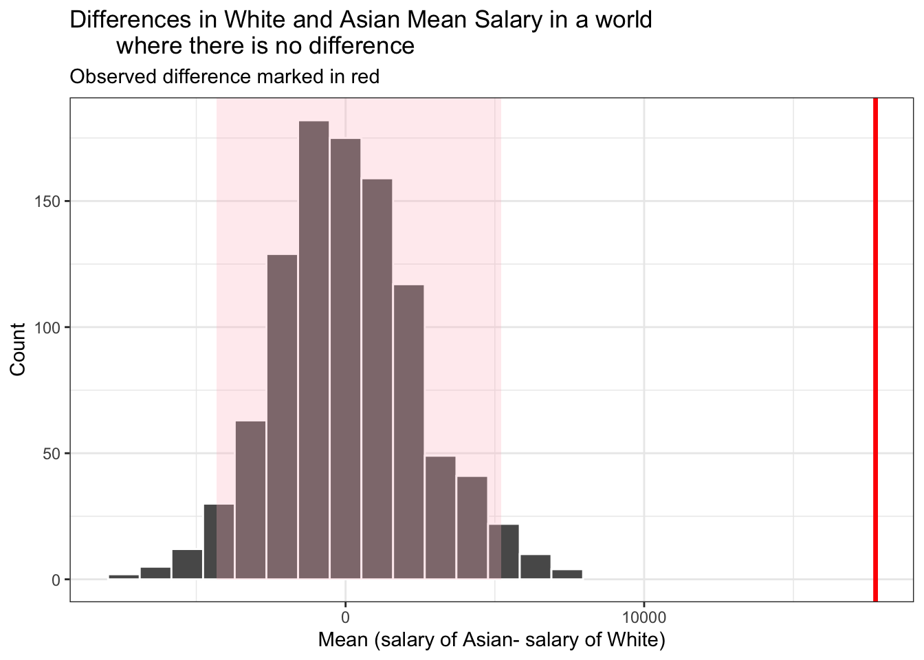
It can be seen in the above diagram that the observed difference for earnings between these two races are out of the 95% CI generated by bootstrap. This means that Asian people do make more than White people. However,we will have to look at the difference in background between these two races before we can conclude that it is “race” alone that leads to the difference in earnings.
Judging by the mean values in earning_race, White and Hispanic have the largest difference in earnings, while in the t-test they are not significantly different. This may be because that the sample size of Asian group is so small that its standard error is very big, therefore the CI includes the mean value for White.
Section 3.4 Education vs. total earnings
clean_data %>%
filter(tot_earnings_USD<300000) %>%
drop_na(highest_level_of_education_completed) %>%
ggplot(aes(x = tot_earnings_USD,
y = fct_reorder(highest_level_of_education_completed,tot_earnings_USD)))+
geom_boxplot()+
labs(title = "Total earning of people with different education level",
subtitle = "for people with earnings ranged from 0 to 300000 USD",
x = "Total earnings in USD",
y = "Highest level of education")+
theme_bw()+
NULL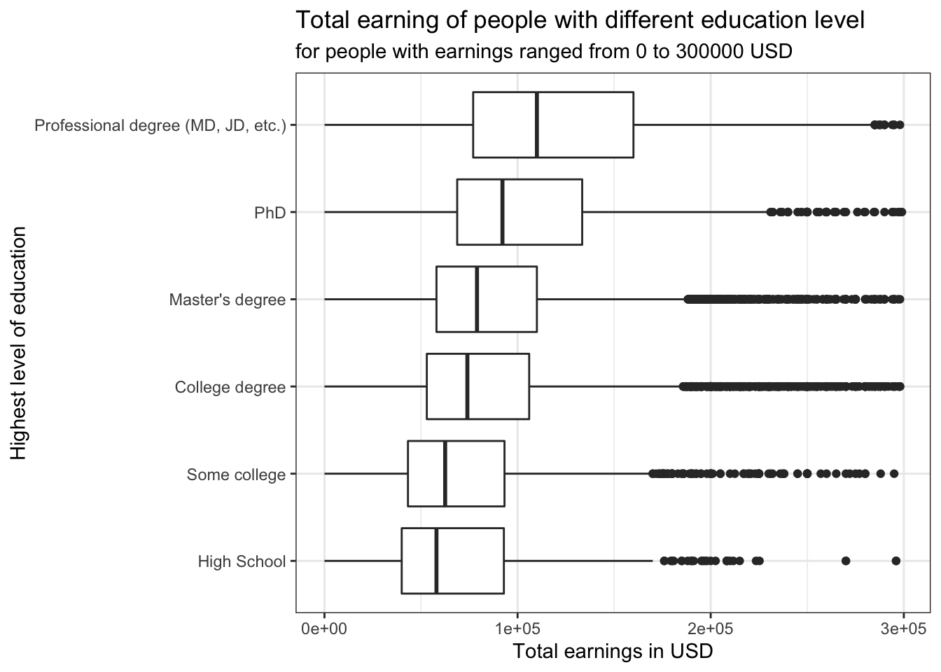 It can be seen in the box plot that as the level of education increases, people tend to make more (except for “Some College”). The closest boxes are Master’s degree and College degree, and to confirm they are significantly different, a bootstrap analysis is used. The reason why people with “Some College” background make the highest mean earnings is probably because people who drop out of college may have started a business of their own and made success out of it.
#Construct a table that contains statistical parameters for different education levels
earning_edu <- clean_data %>%
  group_by(highest_level_of_education_completed) %>%
  summarise (mean = mean(tot_earnings_USD), SD = sd(tot_earnings_USD), sample_size = n()) %>%
  mutate(se = sqrt(SD^2/sample_size), t_value = qt(p=.05/2, df=sample_size-1, lower.tail=FALSE),
         margin_of_error = t_value*se, earning_low = mean-t_value*se, earning_high = mean+t_value*se) %>%
  arrange(desc(mean))

earning_edu
## # A tibble: 7 × 9
## highest_level_of_edu… mean SD sample_size se t_value margin_of_error
## <chr> <dbl> <dbl> <int> <dbl> <dbl> <dbl>
## 1 Professional degree … 1.49e5 1.24e5 1284 3457. 1.96 6782.
## 2 Some college 1.38e5 2.34e6 1902 53628. 1.96 105175.
## 3 PhD 1.14e5 8.69e4 1377 2341. 1.96 4593.
## 4 <NA> 9.85e4 9.07e4 200 6415. 1.97 12650.
## 5 Master's degree 9.75e4 9.84e4 8526 1066. 1.96 2089.
## 6 College degree 9.26e4 7.37e4 12782 652. 1.96 1277.
## 7 High School 8.55e4 8.65e4 572 3618. 1.96 7106.
## # … with 2 more variables: earning_low <dbl>, earning_high <dbl># hypothesis testing using infer package
set.seed(1234)
earning_edu_boot <- clean_data %>%
drop_na(highest_level_of_education_completed) %>%
filter(highest_level_of_education_completed %in% c("College degree","Master's degree")) %>%
# Specify the variable of interest "tot_earnings_USD" and group by race "Asian" and "White"
specify(tot_earnings_USD ~ highest_level_of_education_completed) %>%
# Hypothesize a null of no (or zero) difference
hypothesize (null = "independence") %>%
# Generate a bunch of simualted samples
generate (reps = 1000, type = "permute") %>%
# Find the mean diffference of each sample
calculate(stat = "diff in means",
order = c("Master's degree", "College degree"))
# Select the low and high endpoint from the formula-calculated CIs
formula_ci_edu <- earning_edu %>%
select(earning_low,earning_high)
# Generate 95% percentile of the difference in the two genders' salaries from the bootstrap data
percentile_ci_edu <- earning_edu_boot %>%
get_confidence_interval(level = 0.95, type = "percentile")
percentile_ci_edu## # A tibble: 1 × 2
## lower_ci upper_ci
## <dbl> <dbl>
## 1 -2310. 2239.#Calculate the difference in the mean earnings between Master's and College
observed_difference_edu <- earning_edu$mean[5]-earning_edu$mean[6]
observed_difference_edu## [1] 4878.294The difference between the earning of these two races is not within the 95% confidence interval generated by bootstrap.
visualize(earning_edu_boot) +
annotate("rect", xmin=percentile_ci_edu$lower_ci, xmax=percentile_ci_edu$upper_ci, ymin=0, ymax=Inf, alpha=0.3, fill = "pink") +
labs(title="Differences in Masters' and Bachelors' Mean Salary in a world
where there is no difference",
subtitle = "Observed difference marked in red",
x = "Mean (salary of Masters- salary of Bachlors)", y = "Count")+
geom_vline(xintercept = observed_difference_edu, colour = "red",
linetype="solid",
size=1.2)+
theme_bw()+
NULL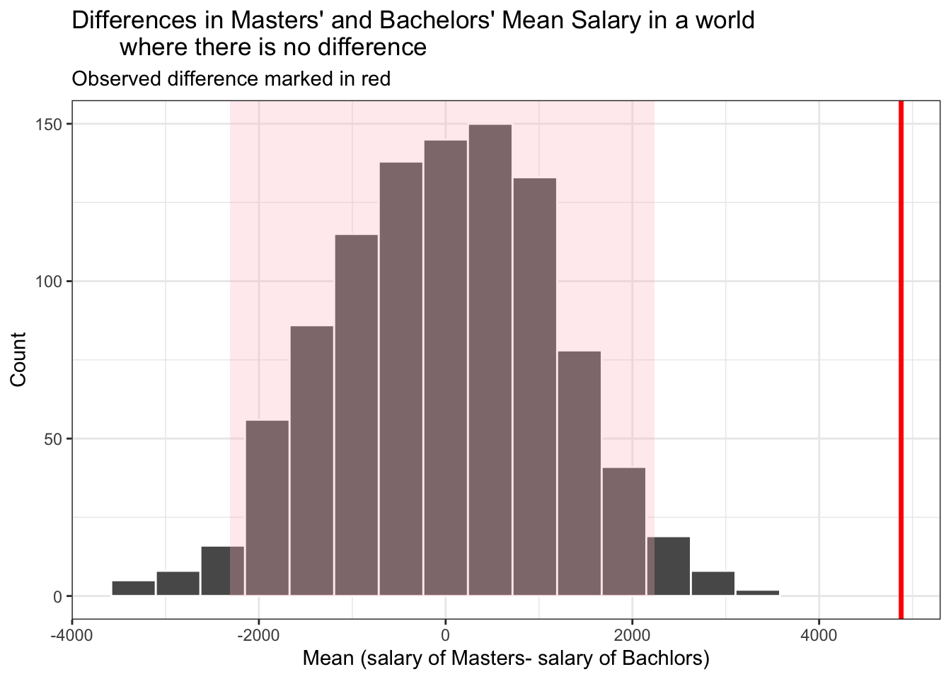 The observed difference is out of the CI region, which means that getting a Master’s degree does help people make more compared to a College degree.
Section 3.5 Experience vs. total earnings
clean_data %>%
  filter(tot_earnings_USD<300000) %>%
  drop_na(overall_years_of_professional_experience) %>%
  ggplot(aes(x = tot_earnings_USD,
             y = fct_reorder(overall_years_of_professional_experience,tot_earnings_USD)))+
  geom_boxplot()+
  labs(title = "Total earning of people with difference oveall experience",
       subtitle = "for people with earnings ranged from 0 to 300000 USD",
       x = "Total earnings in USD",
       y = "Overall experience")+
  theme_bw()+
  NULL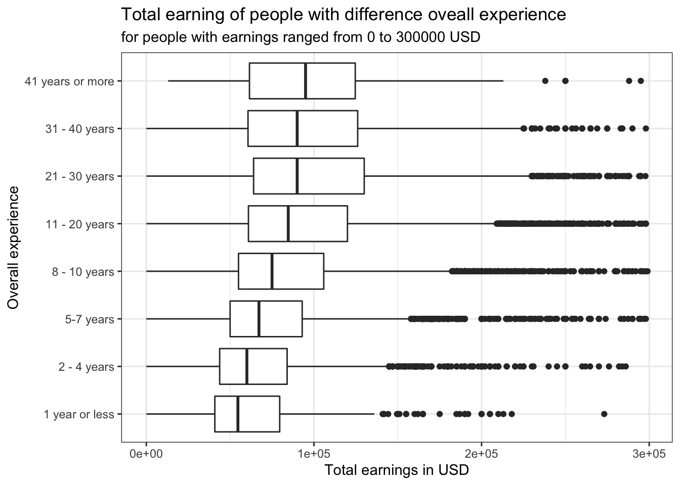
#Construct a table that contains statistical parameters for different years of experience
earning_exp <- clean_data %>%
  group_by(overall_years_of_professional_experience) %>%
  summarise (mean = mean(tot_earnings_USD), SD = sd(tot_earnings_USD), sample_size = n()) %>%
  mutate(se = sqrt(SD^2/sample_size), t_value = qt(p=.05/2, df=sample_size-1, lower.tail=FALSE),
         margin_of_error = t_value*se, earning_low = mean-t_value*se, earning_high = mean+t_value*se) %>%
  arrange(desc(mean))

earning_exp
## # A tibble: 8 × 9
## overall_years_of_pro… mean SD sample_size se t_value margin_of_error
## <chr> <dbl> <dbl> <int> <dbl> <dbl> <dbl>
## 1 21 - 30 years 1.16e5 1.06e5 3515 1789. 1.96 3508.
## 2 8 - 10 years 1.13e5 1.42e6 5128 19899. 1.96 39010.
## 3 31 - 40 years 1.12e5 1.85e5 835 6401. 1.96 12564.
## 4 11 - 20 years 1.07e5 8.79e4 9259 914. 1.96 1791.
## 5 41 years or more 1.06e5 6.63e4 117 6133. 1.98 12148.
## 6 5-7 years 8.35e4 7.35e4 4602 1084. 1.96 2125.
## 7 2 - 4 years 7.28e4 6.25e4 2740 1194. 1.96 2341.
## 8 1 year or less 6.89e4 5.87e4 447 2777. 1.97 5457.
## # … with 2 more variables: earning_low <dbl>, earning_high <dbl>Unlike education level, working for a longer time does not guarantee a higher earning. The highest mean observed is for the group of 21 - 30 years of work experience, while people who worked for 41 years or more only ranked the 5th. While having more experience does not necessarily mean that the earnings will be higher, the original dataset is dominated by the younger groups. For example, there are only 117 samples in the “41 years or more” group, while we have 9259 samples in the “11 - 20 years” group. Therefore, we cannot conclude confidently that people who have more experience make less than people who have less experience.
Now we can run t tests for each increment in experience to see at which stage of career are people more likely to gain a significant increase in their earnings.
# hypothesis testing using t.test()
t.test(tot_earnings_USD ~ overall_years_of_professional_experience,
       data = clean_data %>% filter(overall_years_of_professional_experience %in% c("1 year or less","2 - 4 years")))
##
## Welch Two Sample t-test
##
## data: tot_earnings_USD by overall_years_of_professional_experience
## t = -1.2665, df = 622.71, p-value = 0.2058
## alternative hypothesis: true difference in means between group 1 year or less and group 2 - 4 years is not equal to 0
## 95 percent confidence interval:
## -9763.840 2107.505
## sample estimates:
## mean in group 1 year or less mean in group 2 - 4 years
## 68948.23 72776.39# hypothesis testing using t.test()
t.test(tot_earnings_USD ~ overall_years_of_professional_experience,
data = clean_data %>% filter(overall_years_of_professional_experience %in% c("2 - 4 years","5-7 years")))##
## Welch Two Sample t-test
##
## data: tot_earnings_USD by overall_years_of_professional_experience
## t = -6.6206, df = 6490.5, p-value = 3.865e-11
## alternative hypothesis: true difference in means between group 2 - 4 years and group 5-7 years is not equal to 0
## 95 percent confidence interval:
## -13838.52 -7515.62
## sample estimates:
## mean in group 2 - 4 years mean in group 5-7 years
## 72776.39 83453.46# hypothesis testing using t.test()
t.test(tot_earnings_USD ~ overall_years_of_professional_experience,
data = clean_data %>% filter(overall_years_of_professional_experience %in% c("5-7 years","8 - 10 years")))##
## Welch Two Sample t-test
##
## data: tot_earnings_USD by overall_years_of_professional_experience
## t = -1.4702, df = 5157.4, p-value = 0.1416
## alternative hypothesis: true difference in means between group 5-7 years and group 8 - 10 years is not equal to 0
## 95 percent confidence interval:
## -68365.454 9769.763
## sample estimates:
## mean in group 5-7 years mean in group 8 - 10 years
## 83453.46 112751.31# hypothesis testing using t.test()
t.test(tot_earnings_USD ~ overall_years_of_professional_experience,
data = clean_data %>% filter(overall_years_of_professional_experience %in% c("8 - 10 years","11 - 20 years")))##
## Welch Two Sample t-test
##
## data: tot_earnings_USD by overall_years_of_professional_experience
## t = -0.29524, df = 5148.6, p-value = 0.7678
## alternative hypothesis: true difference in means between group 11 - 20 years and group 8 - 10 years is not equal to 0
## 95 percent confidence interval:
## -44932.04 33169.72
## sample estimates:
## mean in group 11 - 20 years mean in group 8 - 10 years
## 106870.1 112751.3# hypothesis testing using t.test()
t.test(tot_earnings_USD ~ overall_years_of_professional_experience,
data = clean_data %>% filter(overall_years_of_professional_experience %in% c("11 - 20 years","21 - 30 years")))##
## Welch Two Sample t-test
##
## data: tot_earnings_USD by overall_years_of_professional_experience
## t = -4.3658, df = 5445.5, p-value = 1.29e-05
## alternative hypothesis: true difference in means between group 11 - 20 years and group 21 - 30 years is not equal to 0
## 95 percent confidence interval:
## -12708.970 -4832.339
## sample estimates:
## mean in group 11 - 20 years mean in group 21 - 30 years
## 106870.1 115640.8# hypothesis testing using t.test()
t.test(tot_earnings_USD ~ overall_years_of_professional_experience,
data = clean_data %>% filter(overall_years_of_professional_experience %in% c("21 - 30 years","31 - 40 years")))##
## Welch Two Sample t-test
##
## data: tot_earnings_USD by overall_years_of_professional_experience
## t = 0.50796, df = 967.99, p-value = 0.6116
## alternative hypothesis: true difference in means between group 21 - 30 years and group 31 - 40 years is not equal to 0
## 95 percent confidence interval:
## -9667.158 16419.505
## sample estimates:
## mean in group 21 - 30 years mean in group 31 - 40 years
## 115640.8 112264.6# hypothesis testing using t.test()
t.test(tot_earnings_USD ~ overall_years_of_professional_experience,
data = clean_data %>% filter(overall_years_of_professional_experience %in% c("31 - 40 years","41 years or more")))##
## Welch Two Sample t-test
##
## data: tot_earnings_USD by overall_years_of_professional_experience
## t = 0.7124, df = 434.61, p-value = 0.4766
## alternative hypothesis: true difference in means between group 31 - 40 years and group 41 years or more is not equal to 0
## 95 percent confidence interval:
## -11108.56 23739.97
## sample estimates:
## mean in group 31 - 40 years mean in group 41 years or more
## 112264.6 105948.9As the years of experience increases, the increase in mean earnings is not necessarily significant. In other words, people’s earning does not always increase significantly when they work longer. The only two significant differences in earnings are observed from 2 - 4 years to 5 - 7 years and from 11 - 20 years to 21 - 30 years. Based on this finding, people are likely to have a significant gain in thier earnings at the middle stages of their career. Also, since people with longer experience already make a lot more than they do at their early stages of career, the relative increase in their earnings will be not as evident. Again, the sample is heavily biased towards the people at middle stages of career, so it is expected that people with 30+ years of experience will have a large SE, thus large CI that makes the increase in earnings appear less significant.
Section 4 - Analysis using Correlation and Linear Regression
In order to find a model to predict and explain our dependent variable “salary”, we will run a regression analysis. We now plot the density of the log of total earnings to see if it normally distributed. As in section 2, it is probably optimal to use the log of total earnings (USD) as it is normally distributed, in comparison to the untransformed version. We also remove rows with omitted variables as they are not useful in the regression.
regression_data <- clean_data %>%
  na.omit()
We further remove all total earnings data with a value of 0, as the earnings data is the dependent variable we are trying to explain.
regression_data <- regression_data[regression_data$tot_earnings_USD != 0,] %>%
  mutate(log_earnings = log(tot_earnings_USD))
Based on these initial data transformations, we now create a naive model, regressing on the log of incomes, with a couple of basic variables.
model_1 <- lm(log_earnings ~ how_old_are_you + overall_years_of_professional_experience +
     years_of_experience_in_field, data = regression_data)

model_1 %>% get_regression_table()
## # A tibble: 21 × 7
## term estimate std_error statistic p_value lower_ci upper_ci
## <chr> <dbl> <dbl> <dbl> <dbl> <dbl> <dbl>
## 1 intercept 10.9 0.036 307. 0 10.9 11.0
## 2 how_old_are_you: 25-34 0.163 0.027 6.13 0 0.111 0.215
## 3 how_old_are_you: 35-44 0.191 0.029 6.55 0 0.134 0.248
## 4 how_old_are_you: 45-54 0.077 0.033 2.30 0.022 0.011 0.142
## 5 how_old_are_you: 55-64 -0.052 0.042 -1.23 0.218 -0.135 0.031
## 6 how_old_are_you: 65 o… -0.069 0.083 -0.839 0.402 -0.232 0.093
## 7 how_old_are_you: unde… -0.05 0.232 -0.215 0.83 -0.505 0.405
## 8 overall_years_of_prof… -0.097 0.045 -2.17 0.03 -0.185 -0.009
## 9 overall_years_of_prof… -0.109 0.042 -2.57 0.01 -0.192 -0.026
## 10 overall_years_of_prof… -0.134 0.048 -2.80 0.005 -0.228 -0.04
## # … with 11 more rowsmodel_1 %>% get_regression_summaries()## # A tibble: 1 × 9
## r_squared adj_r_squared mse rmse sigma statistic p_value df nobs
## <dbl> <dbl> <dbl> <dbl> <dbl> <dbl> <dbl> <dbl> <dbl>
## 1 0.085 0.084 0.371 0.609 0.609 94.5 0 20 20493The naive model produces a quite low adj r squared, indicating that 8,4% of the variability can be explained by the model. The absolute fit of the model (RMSE) confirms our relatively bad fit of the model produced. (lower values indicate better fit, 0 = perfect fit).
Further we will slightly clean our Education variables so as to make things easier in our regression analysis.
regression_data$highest_level_of_education_completed <- gsub("Some college", "College degree", regression_data$highest_level_of_education_completed)Dealing wiht non numeric values makes it difficult to extract meaningful data from our regressions on this data set. To mitigate this, we will create dummy variables for the gender, education, race, industry and country variables.
regression_data_dummies <- regression_data %>%
  dummy_cols(select_columns = c("gender", "highest_level_of_education_completed", "race"))

top_10_country_dummies <- top_10_clean_data %>%
  dummy_cols(select_columns = c("gender", "highest_level_of_education_completed", "race", "Industry", "Country"))
Next we need to slightly adapt the column names of our dummy variables, in order to go forward with our regression analysis.
names(regression_data_dummies)[names(regression_data_dummies) == "highest_level_of_education_completed_Master's degree"] <- "highest_level_of_education_completed_Masters_degree"
names(regression_data_dummies)[names(regression_data_dummies) == "highest_level_of_education_completed_College degree"] <- "highest_level_of_education_completed_College_degree"
names(regression_data_dummies)[names(regression_data_dummies) == "highest_level_of_education_completed_High School"] <- "highest_level_of_education_completed_High_School"
After adjusting our data, we can now run our second regression model. Here we regress on the log of earnings using the explanatory variables of gender, professional experience, experience in the industry, education and race:
model_2 <- lm(log_earnings ~ how_old_are_you + overall_years_of_professional_experience +
     years_of_experience_in_field  + gender_Man + gender_Woman + highest_level_of_education_completed_College_degree + highest_level_of_education_completed_High_School + highest_level_of_education_completed_Masters_degree  + race_Asian + race_White + race_Hispanic + race_Black , data = regression_data_dummies)

model_2 %>% get_regression_table()
## # A tibble: 30 × 7
## term estimate std_error statistic p_value lower_ci upper_ci
## <chr> <dbl> <dbl> <dbl> <dbl> <dbl> <dbl>
## 1 intercept 11.2 0.044 256. 0 11.1 11.3
## 2 how_old_are_you: 25-34 0.102 0.026 3.98 0 0.052 0.152
## 3 how_old_are_you: 35-44 0.083 0.028 2.93 0.003 0.028 0.139
## 4 how_old_are_you: 45-54 -0.028 0.032 -0.855 0.392 -0.091 0.036
## 5 how_old_are_you: 55-64 -0.128 0.041 -3.13 0.002 -0.208 -0.048
## 6 how_old_are_you: 65 o… -0.127 0.079 -1.60 0.109 -0.283 0.029
## 7 how_old_are_you: unde… -0.081 0.223 -0.366 0.715 -0.518 0.355
## 8 overall_years_of_prof… 0.046 0.043 1.07 0.286 -0.038 0.13
## 9 overall_years_of_prof… -0.055 0.041 -1.34 0.18 -0.134 0.025
## 10 overall_years_of_prof… 0.039 0.046 0.853 0.394 -0.051 0.13
## # … with 20 more rowsmodel_2 %>% get_regression_summaries()## # A tibble: 1 × 9
## r_squared adj_r_squared mse rmse sigma statistic p_value df nobs
## <dbl> <dbl> <dbl> <dbl> <dbl> <dbl> <dbl> <dbl> <dbl>
## 1 0.16 0.159 0.340 0.583 0.584 135. 0 29 20493Comparing our Model_2 to the Naive model, we have been able to nearly double the explanatory power while slightly reducing our RMSE value, thus indicating a marginally better fit. Seeing that there are multiple variables with a very high p-value of up to 80%, makes it clear that we need to further clean and adjust our data for a better regression.
car::vif(model_2)## GVIF Df
## how_old_are_you 10.427051 6
## overall_years_of_professional_experience 38.110088 7
## years_of_experience_in_field 12.404795 7
## gender_Man 4.859013 1
## gender_Woman 4.844111 1
## highest_level_of_education_completed_College_degree 3.112847 1
## highest_level_of_education_completed_High_School 1.173148 1
## highest_level_of_education_completed_Masters_degree 3.009433 1
## race_Asian 1.602282 1
## race_White 2.135008 1
## race_Hispanic 1.287184 1
## race_Black 1.323463 1
## GVIF^(1/(2*Df))
## how_old_are_you 1.215757
## overall_years_of_professional_experience 1.296974
## years_of_experience_in_field 1.197053
## gender_Man 2.204317
## gender_Woman 2.200934
## highest_level_of_education_completed_College_degree 1.764326
## highest_level_of_education_completed_High_School 1.083119
## highest_level_of_education_completed_Masters_degree 1.734772
## race_Asian 1.265813
## race_White 1.461167
## race_Hispanic 1.134541
## race_Black 1.150419We then run a Variance inflation factor (VIF) analysis to get a sense of the multicollinearity within our regression variables. Since overall years of professional experience has very high multicollinearity, we remove it in order to further improve our model.
model_3 <- lm(log_earnings ~ how_old_are_you  + years_of_experience_in_field  + gender_Man + gender_Woman + highest_level_of_education_completed_College_degree + highest_level_of_education_completed_High_School + highest_level_of_education_completed_Masters_degree  + race_Asian + race_White + race_Hispanic + race_Black , data = regression_data_dummies)

model_3 %>% get_regression_table()
## # A tibble: 23 × 7
## term estimate std_error statistic p_value lower_ci upper_ci
## <chr> <dbl> <dbl> <dbl> <dbl> <dbl> <dbl>
## 1 intercept 11.1 0.037 300. 0 11.1 11.2
## 2 how_old_are_you: 25-34 0.125 0.024 5.28 0 0.079 0.171
## 3 how_old_are_you: 35-44 0.133 0.025 5.31 0 0.084 0.182
## 4 how_old_are_you: 45-54 0.018 0.028 0.644 0.52 -0.037 0.072
## 5 how_old_are_you: 55-64 -0.099 0.035 -2.85 0.004 -0.167 -0.031
## 6 how_old_are_you: 65 o… -0.091 0.074 -1.23 0.219 -0.235 0.054
## 7 how_old_are_you: unde… -0.06 0.222 -0.271 0.786 -0.496 0.375
## 8 years_of_experience_i… 0.509 0.023 22.2 0 0.464 0.554
## 9 years_of_experience_i… 0.126 0.021 5.88 0 0.084 0.168
## 10 years_of_experience_i… 0.69 0.028 24.6 0 0.635 0.745
## # … with 13 more rowsmodel_3 %>% get_regression_summaries()## # A tibble: 1 × 9
## r_squared adj_r_squared mse rmse sigma statistic p_value df nobs
## <dbl> <dbl> <dbl> <dbl> <dbl> <dbl> <dbl> <dbl> <dbl>
## 1 0.159 0.158 0.341 0.584 0.584 176. 0 22 20493Our next attempt at regressing our data, does nothing to the explanatory power of the model nor the fit, but removes the VIF issues we discoverd in our VIF analysis. The model however still consits of a hand full of variables whose p-values are too high to be statistically relevant. We now run another VIF analysis to make sure we have removed our collinearity concerns.
car::vif(model_3)## GVIF Df GVIF^(1/(2*Df))
## how_old_are_you 3.153231 6 1.100431
## years_of_experience_in_field 3.099245 7 1.084151
## gender_Man 4.855284 1 2.203471
## gender_Woman 4.841524 1 2.200346
## highest_level_of_education_completed_College_degree 3.053306 1 1.747371
## highest_level_of_education_completed_High_School 1.165006 1 1.079354
## highest_level_of_education_completed_Masters_degree 2.970877 1 1.723623
## race_Asian 1.599801 1 1.264833
## race_White 2.134307 1 1.460927
## race_Hispanic 1.286517 1 1.134247
## race_Black 1.323113 1 1.150266In our following model, we will now remove any variables that were not significant at 5% level in model_3. Thus we remove variables such as the age groups 25-34, 35-44 and 55-64. We will also remove some outliers (10%) to try to improve the fit of the regression, as some variables’ outliers may be influencing the regression.
Here we remove the age brackets which proved insignificant in the regression.
regression_data_filtered <- regression_data_dummies %>%
  filter(how_old_are_you == "25-34" | how_old_are_you == "35-44" | how_old_are_you == "55-64")
After performing the latest data transformations we now attempt another regretion with the same variables as model_3 except for race_Black which has been removed and the age values which were omitted for insignificance.
model_4 <- lm(log_earnings ~ how_old_are_you  + years_of_experience_in_field  + gender_Man + gender_Woman + highest_level_of_education_completed_College_degree + highest_level_of_education_completed_High_School + highest_level_of_education_completed_Masters_degree  + race_Asian + race_White + race_Hispanic , data = regression_data_filtered)

model_4 %>% get_regression_table()
## # A tibble: 18 × 7
## term estimate std_error statistic p_value lower_ci upper_ci
## <chr> <dbl> <dbl> <dbl> <dbl> <dbl> <dbl>
## 1 intercept 11.3 0.036 317. 0 11.2 11.3
## 2 how_old_are_you: 35-44 0.005 0.011 0.453 0.651 -0.016 0.025
## 3 how_old_are_you: 55-64 -0.229 0.028 -8.14 0 -0.284 -0.174
## 4 years_of_experience_i… 0.525 0.025 20.8 0 0.475 0.574
## 5 years_of_experience_i… 0.133 0.024 5.44 0 0.085 0.18
## 6 years_of_experience_i… 0.709 0.036 19.7 0 0.638 0.779
## 7 years_of_experience_i… 0.687 0.052 13.2 0 0.585 0.788
## 8 years_of_experience_i… 0.763 0.145 5.27 0 0.479 1.05
## 9 years_of_experience_i… 0.285 0.024 11.8 0 0.238 0.332
## 10 years_of_experience_i… 0.389 0.025 15.8 0 0.341 0.438
## 11 gender_Man 0.365 0.025 14.7 0 0.316 0.414
## 12 gender_Woman 0.058 0.023 2.50 0.012 0.012 0.103
## 13 highest_level_of_educ… -0.374 0.015 -24.8 0 -0.403 -0.344
## 14 highest_level_of_educ… -0.621 0.038 -16.4 0 -0.695 -0.546
## 15 highest_level_of_educ… -0.338 0.016 -21.5 0 -0.368 -0.307
## 16 race_Asian 0.267 0.025 10.9 0 0.219 0.315
## 17 race_White -0.06 0.015 -4.00 0 -0.089 -0.03
## 18 race_Hispanic -0.071 0.032 -2.19 0.029 -0.134 -0.007model_4 %>% get_regression_summaries()## # A tibble: 1 × 9
## r_squared adj_r_squared mse rmse sigma statistic p_value df nobs
## <dbl> <dbl> <dbl> <dbl> <dbl> <dbl> <dbl> <dbl> <dbl>
## 1 0.154 0.153 0.320 0.566 0.566 184. 0 17 17196In our 4th regression model, we have now been able to marginally improve the fit (RMSE), while simultaneously reducing our explanatory power. Moving forward, we eliminate the top and bottom 5% (outliers) from the total earnings category. We also still have one more variable whose p-value is above the 5% threshold.
Q <- quantile(regression_data_filtered$tot_earnings_USD, probs=c(.05, .95))

regression_no_outliers <- subset(regression_data_filtered, regression_data_filtered$tot_earnings_USD > (Q[1]) & regression_data_filtered$tot_earnings_USD < (Q[2]))
We also remove the age cateogry 35-44 as it was insignificant in the previous regression.
regression_no_outliers <- regression_no_outliers %>%
  filter(how_old_are_you == "25-34" | how_old_are_you == "55-64")
After running 4 regressions and adjusting our input data, we now run our 5th and final regression.
model_5 <- lm(log_earnings ~ how_old_are_you  + years_of_experience_in_field  + gender_Man + gender_Woman + highest_level_of_education_completed_College_degree + highest_level_of_education_completed_High_School + highest_level_of_education_completed_Masters_degree  + race_Asian + race_White + race_Hispanic , data = regression_no_outliers)

model_5 %>% get_regression_table()
## # A tibble: 17 × 7
## term estimate std_error statistic p_value lower_ci upper_ci
## <chr> <dbl> <dbl> <dbl> <dbl> <dbl> <dbl>
## 1 intercept 11.3 0.032 353. 0 11.2 11.4
## 2 how_old_are_you: 55-64 -0.124 0.026 -4.77 0 -0.175 -0.073
## 3 years_of_experience_i… 0.353 0.026 13.7 0 0.302 0.404
## 4 years_of_experience_i… 0.071 0.021 3.45 0.001 0.03 0.111
## 5 years_of_experience_i… 0.444 0.041 10.9 0 0.363 0.524
## 6 years_of_experience_i… 0.495 0.042 11.7 0 0.412 0.578
## 7 years_of_experience_i… 0.588 0.127 4.65 0 0.34 0.837
## 8 years_of_experience_i… 0.171 0.02 8.36 0 0.131 0.211
## 9 years_of_experience_i… 0.272 0.021 12.7 0 0.23 0.314
## 10 gender_Man 0.252 0.023 10.9 0 0.206 0.297
## 11 gender_Woman 0.059 0.021 2.82 0.005 0.018 0.101
## 12 highest_level_of_educ… -0.261 0.016 -16.4 0 -0.292 -0.23
## 13 highest_level_of_educ… -0.466 0.046 -10.1 0 -0.557 -0.375
## 14 highest_level_of_educ… -0.243 0.017 -14.6 0 -0.275 -0.21
## 15 race_Asian 0.2 0.022 9.20 0 0.157 0.243
## 16 race_White -0.067 0.014 -4.93 0 -0.094 -0.041
## 17 race_Hispanic -0.072 0.03 -2.44 0.015 -0.131 -0.014model_5 %>% get_regression_summaries()## # A tibble: 1 × 9
## r_squared adj_r_squared mse rmse sigma statistic p_value df nobs
## <dbl> <dbl> <dbl> <dbl> <dbl> <dbl> <dbl> <dbl> <dbl>
## 1 0.13 0.128 0.150 0.388 0.388 81.3 0 16 8763In our final regression, our model again loses more of its explanatory power but significantly improves its fit, from 0.609 in the naive model to 0.388.
After running multiple regressions, continuously adjusting our data, we were not able to derive a regression model with a strong explanatory power for the log of total earnings. Our final model only can explain for 12,8% of the variability. Our RMSE of 0.38 provides for a good but not great fit of our model. Overall our data lacked valuable numerical data, which could significantly improved our model. For example if age and experiences were provided in exact years instead of a range of years, we could have increased our explanatory power and produced a more accurate model.